State Street

A new chapter for a storied financial institution
This story started on the streets of Boston—more than 230 years ago.
State Street has spent over two centuries as a trusted partner to its clients. While the company began as a local maritime bank, it’s grown into a global custody bank and asset manager. Today, it’s a powerhouse that’s ushering in a new era of innovation for the world’s investors across the investment cycle.
We partnered with State Street to evolve its brand, first with a compelling articulation of State Street’s story, differentiation and vision for the future, and then with a reimagined identity built for the modern world. Our remit was clear: create a category-leading brand that unified State Street and communicated the breadth of its offerings.
To do so, we rolled up our sleeves to get a robust understanding of State Street, both inside and out. Our takeaway? Its strength and scale, innovation and platforms, partnership and unique expertise give it a perspective that competitors can’t touch. With nearly 10 percent of the world’s assets serviced by State Street, the company can harness an immense amount of technology and data.
In short, State Street gives clients an essential advantage, elevating their performance and moving the industry forward with leading tech, data, talent, thought leadership, and solutions. This became the unifying story we used as our North Star to evolve every facet of the brand, forming the foundation of not just what State Street says, but how it shows up in the market. We then created a brand architecture approach that will unify over 20 sub-brands to tell a more holistic, cohesive brand story at scale and drive simplicity in the client experience.

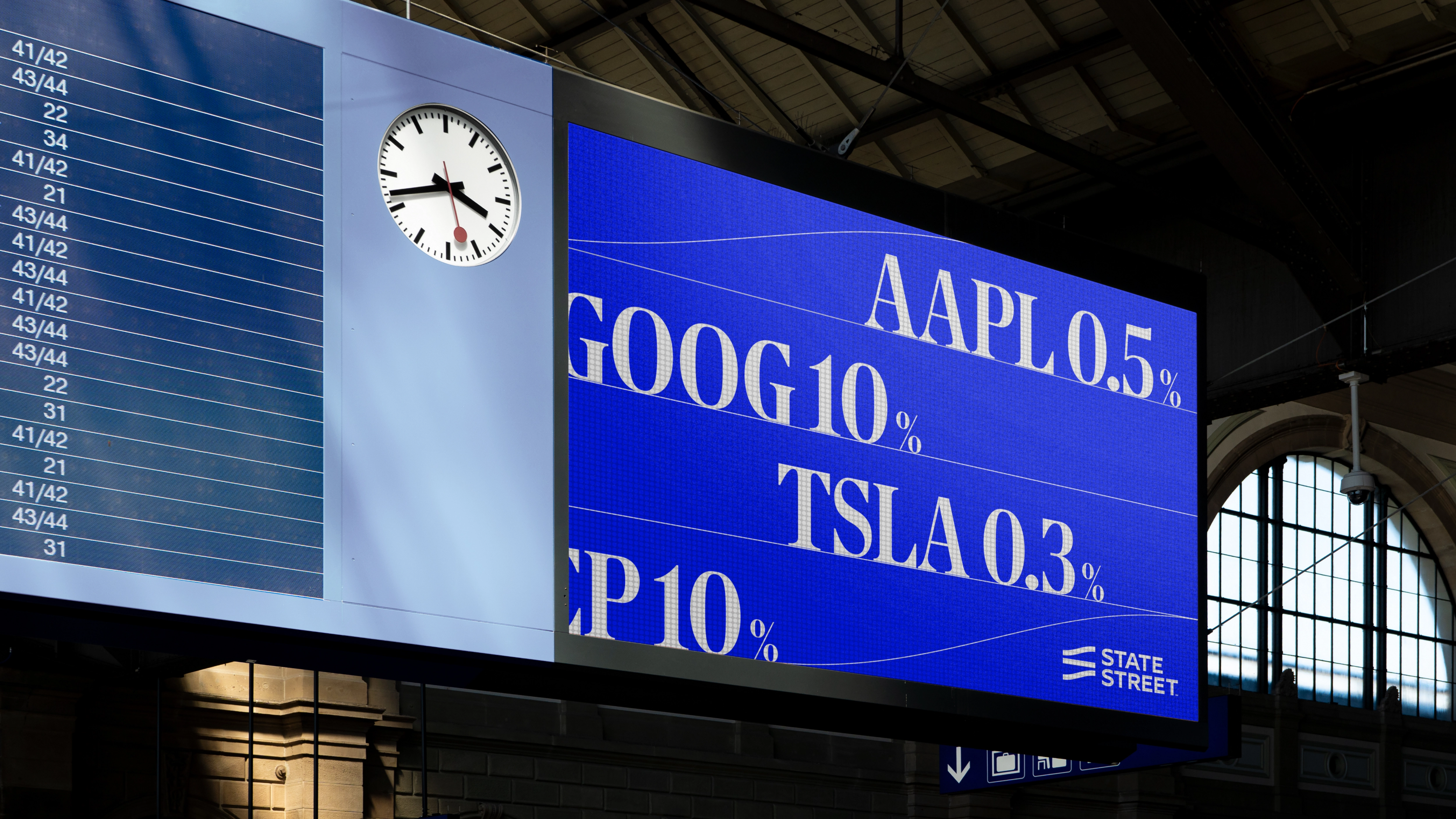
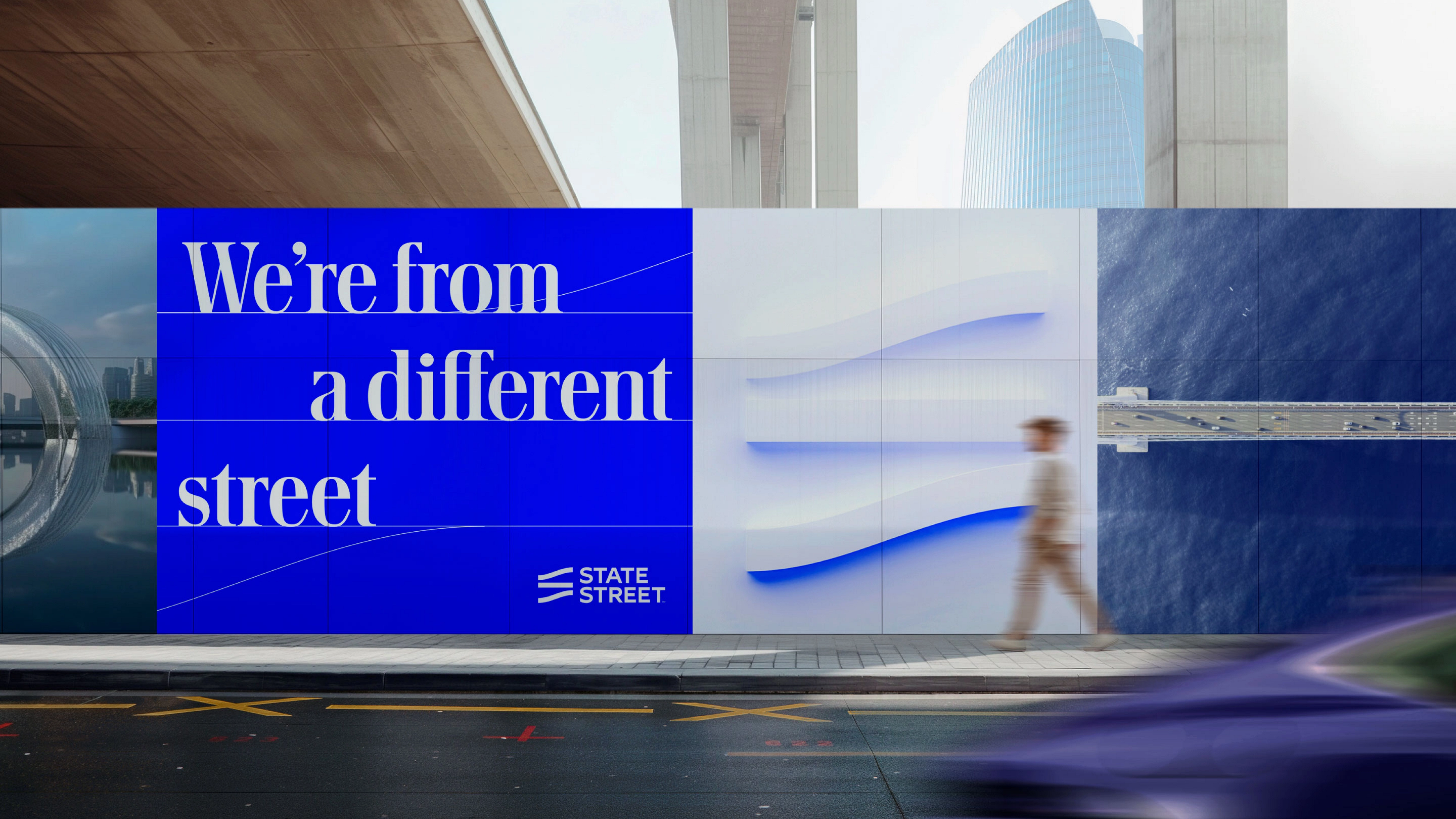
We needed to create a dynamic, ownable brand expression that would reinforce State Street’s differentiation in a category where competitors are modernizing and raising the bar. The new logo evokes the brand’s name—the central ‘street’ within the symbol represents the journey State Street designs for its clients — helping them stay on track, turn market change into potential, and continue to be the steadying hand and stabilizing force that’s reshaping the industry. The central line of the symbol extends across the system, serving as the underlying grid as well as a visible connective element through photography, patterns and icons, acting as a nod to State Street platforms that underpin financial markets.
The brand expression integrates State Street’s longevity and vision, using elements that take inspiration from both traditional and future-facing cues. This includes adopting a modern serif typeface and energizing State Street’s legacy blue. Mezzotint images provide a distinct way of capturing subjects, combining the bespoke quality of engraving with a modern digital language.
The new system is built to thrive across digital channels, with fresh content, imagery, and styles that cascade across platforms. To celebrate the new brand, we helped coordinate a robust re-introduction of State Street across all stakeholder groups. This included a rebuild of the State Street corporate website, social media presence, launch microsite, presentation system, pitch narrative and more. These activations showcase State Street’s story, commitments, expression and leadership, with opportunities for audiences to engage across content and media or connect directly.
“We’re modernizing our brand to better reflect the company we are today—innovative, transformative and client centric. We refer to our new symbol as “The Street,” representing the journey we design for our clients, helping them stay on track, turn market change into potential, and be the stabilizing force that’s reshaping the industry.”
