Mass General Brigham

Uniting a healthcare brand for patient excellence
Building a brand in a global pandemic
Lippincott has helped rebrand complex healthcare organizations in the past—but never have we been pressed to launch a brand in the height of a global pandemic.
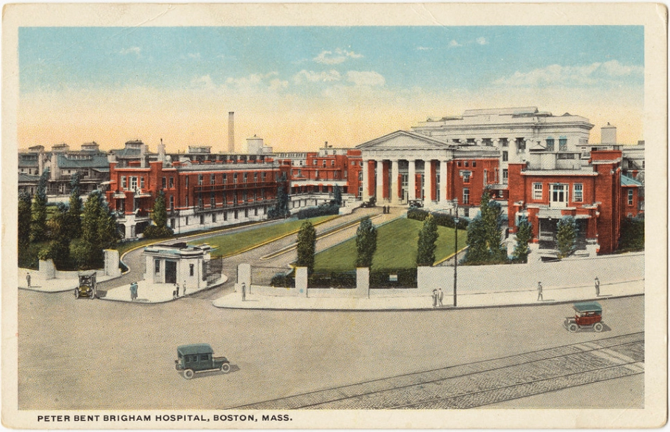
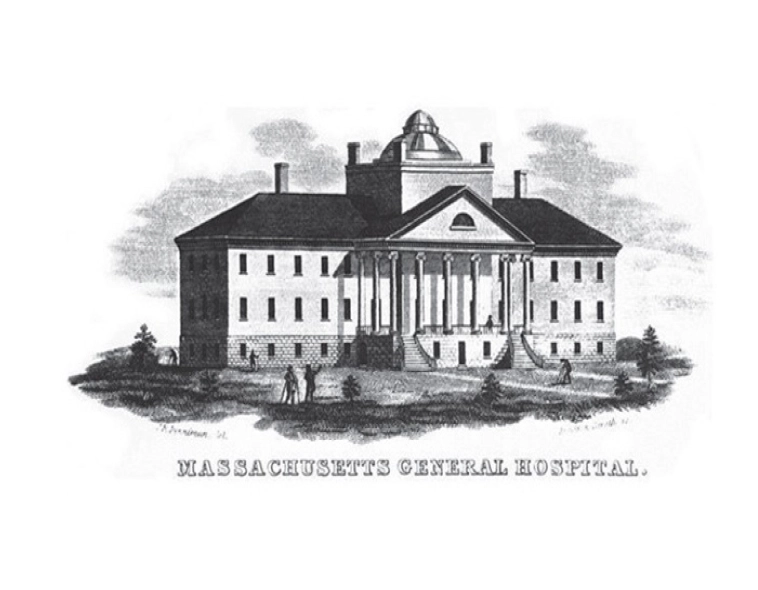
To set the stage, 25+ years ago, Boston’s two leading academic medical centers, Brigham and Women’s Hospital and Massachusetts General Hospital, came together to become Partners Healthcare. Over time, Partners Healthcare grew into a large group of academic medical centers, specialty and community hospitals, and affiliated practices – with minimal connection to a shared, overarching brand. They realized that to advance their global leadership in the increasingly competitive healthcare industry, they would need to create a simpler way for patients to understand and experience the connectivity of their diverse member organizations. Building a strong, integrated brand for the system was step one toward this vision of a more unified, patient-centered future.
Partners Healthcare tapped Lippincott for a fresh, comprehensive rebrand. We would create a new name, brand platform, visual system, architecture, and patient experience vision. But as quickly as the assignment was awarded, the onset of COVID-19 drastically changed the dynamic and put us on a more urgent course and timeline.
A strategically-grounded name
We began the process by developing a new name: Mass General Brigham. Research and insight showed the name retains key brand name elements in a succinct and believable combination. It draws from the most familiar elements of each original brand, but delivers greater impact than either on its own. The research proved this point over and over again, whether we were asking patients in the Boston region or across the US. And because the name isn’t constrained by a descriptor like healthcare or system, Mass General Brigham can flex across a broader range of offerings and member organizations.
A visual system rich with meaning
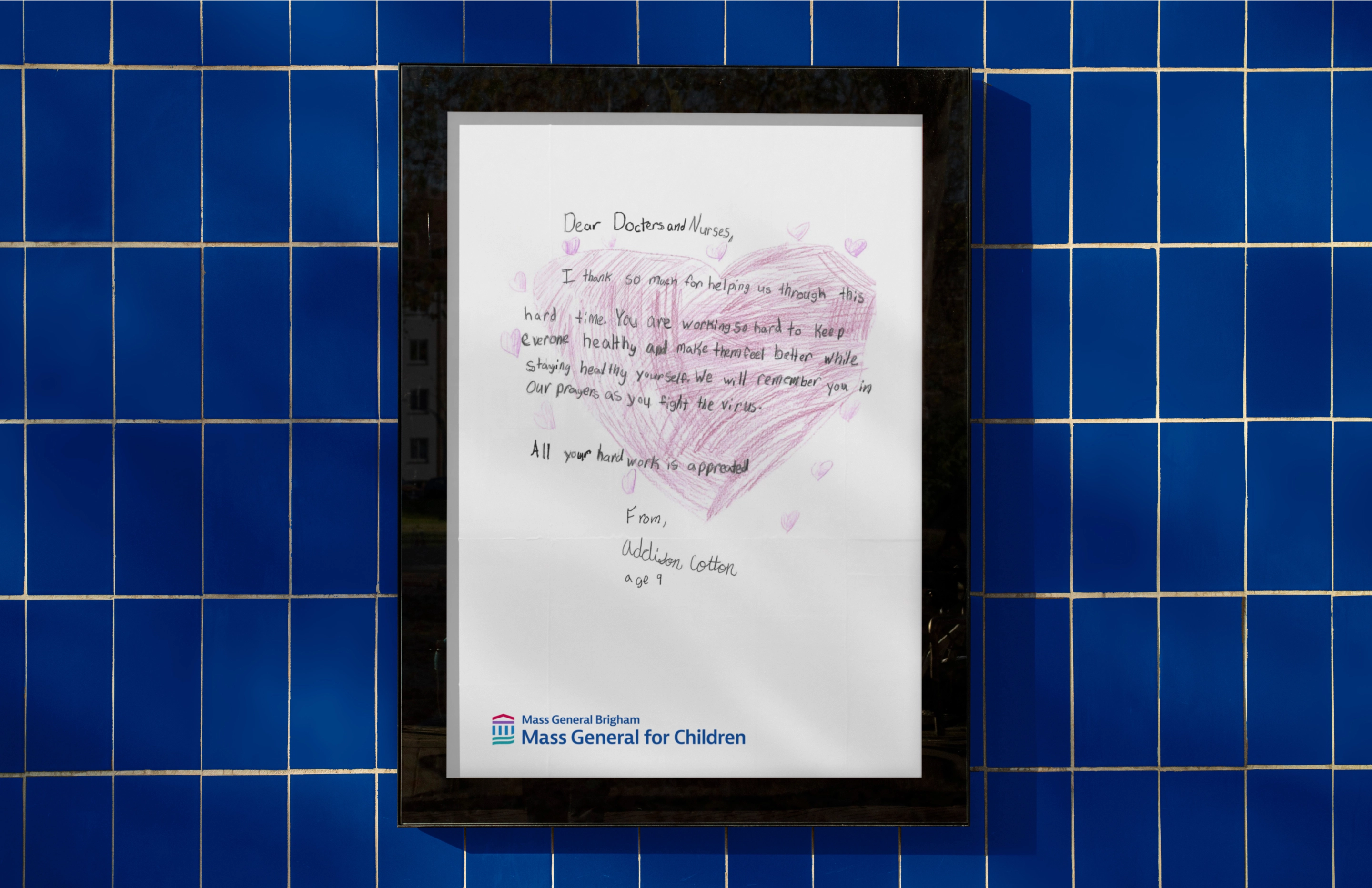
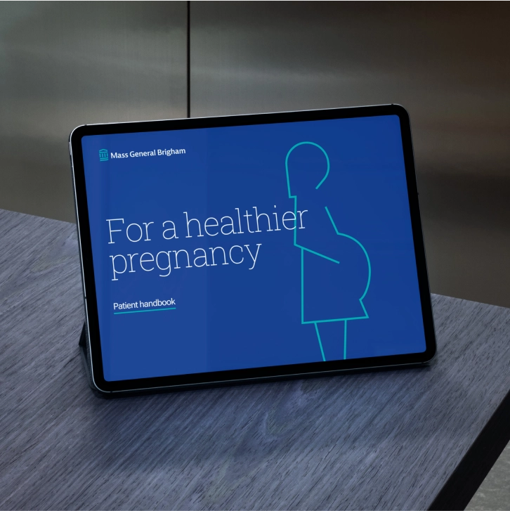
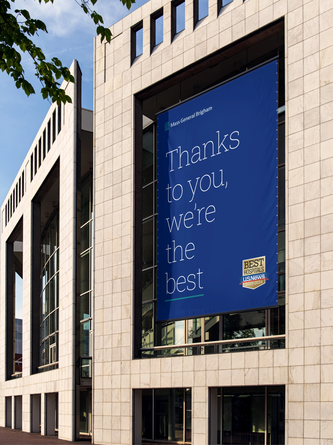
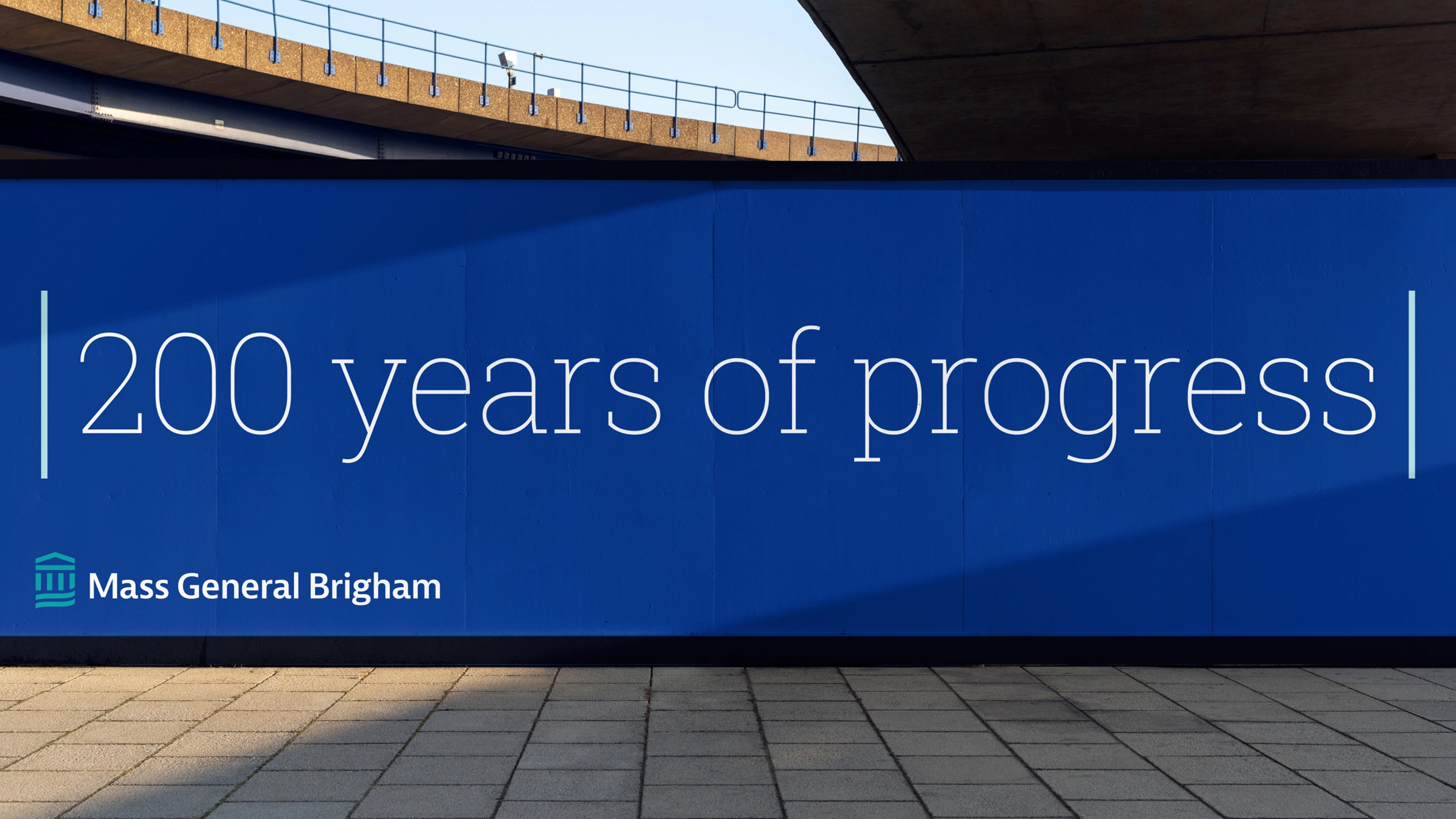
Next was the new logo. Our aim was to create a logo that would symbolize knowledge, progress, unity, and care. The mark celebrates the stature and history of the brand’s academic centers, with the promise of revolutionary medicine and transformative care for patients. The visual system balances warmth and sophistication, with a flexible typographic style reflecting its unique academic heritage and a linear styling used to frame and highlight key content.
The new eye-level imagery style captures the brand’s leadership and care through authentic moments.
Armed with the new name and visual identity, we rapidly undertook the task of mapping how they could be implemented across all organizations that fall under the Mass General Brigham umbrella, building a stronger, simpler system for patients.
Bringing an essential brand to life
The COVID-19 pandemic showed with remarkable clarity the importance of collaboration and cohesion across a healthcare system. We helped execute the launch of Mass General Brigham, nimbly coordinating across multiple agency partners to bring the brand to life at a critical time. Following its launch, Mass General Brigham is poised to better serve its current and future patients in a COVID-19 world and beyond.
