Korean Air

Creating an ambassador for modern Korea


Since its last iteration in 1984, Korean Air’s logo and livery have long been aviation icons. Yet even a timeless icon must evolve to remain relevant. The acquisition of Asiana Airlines presented the perfect moment for such an evolution, aligning with a broader transformation of the passenger experience.
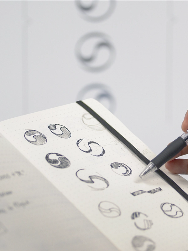
At the heart of the new identity is a beautifully reimagined Taegeuk, inspired by the South Korean flag. This refreshed symbol combines the strength of the original design with the elegance and energy of Sangmo Nori, a folkloric Korean dance known for its flowing ribbon movements, symbolizing prosperity and abundance.
Much like the “Union Jack” in the United Kingdom or the “Stars and Stripes” of the United States, the Taegeuk is widely venerated and used in South Korea. Thus, a unique reinterpretation was vital for Korean Air to affirm its flag carrier status while standing apart from other organizations.


To compete with low-cost carriers and expand Seoul’s role as a global aviation hub, Korean Air needed to confidently reposition itself as a thoroughly premium airline.
Guided by its “Excellence in Flight” ethos, the redesign focused on elevating Business and First-Class offerings and creating a hospitality-inspired passenger experience.
Lippincott’s design solution gave flight to this transformation. First, the Taegeuk symbol underwent an elegant reinterpretation, liberated from its previous placement within the logotype. This redesign allows the symbol to stand independently, enhancing its visibility in the cabin environments designed by PriestmanGoode.
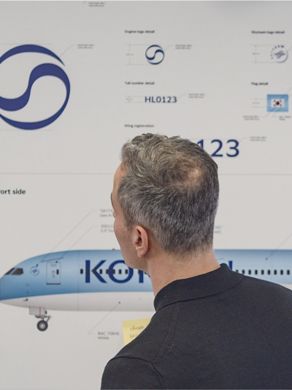
As a complement, Lippincott developed a refined logotype, inspired by high-end hospitality. Its lightness, combined with tapered terminals, echoes the Taegeuk's design and evokes calligraphic brush strokes, adding elegance to the new identity. Additionally, bespoke Latin and Hangul brand fonts were crafted in partnership with Dalton Maag to harmonize with the logotype and unify all communications.


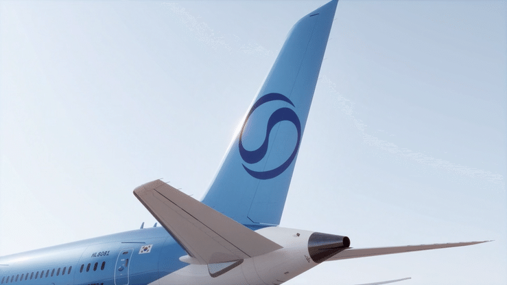
For over 40 years, Korean Air’s blue-top livery has distinguished its fleet. To balance heritage with innovation, Lippincott partnered with AkzoNobel to develop a bespoke metallic blue – a bold, modern evolution of the original.
The word “Air” was dropped from the fuselage logotype, allowing “Korean” to take center stage. This redesign reinforces the airline’s flag carrier status and enhances brand visibility from every modern airport vantage point.

Korean Air’s refreshed branding extends seamlessly across physical and digital touchpoints. The blue spectrum was retained to ensure recognition, while subtle accents of blue enhance the redesigned cabin environments and their dark neutral tones.
A digital toolkit was developed to unify the brand across channels, including icons inspired by the typography and abstract blue renders derived from the Taegeuk. These soothing, uplifting visuals reinforce the airline’s premium positioning.
The new identity and livery debuted globally in March 2025.