


Southwest Airlines

Getting to the heart of a beloved brand


Even with a very human reputation and 40+ consecutive years of profitability, Southwest Airlines isn’t immune to competitive and market pressures.
Competitors have attempted to undercut them on price by unbundling services (and then charging for extras), and rivals have upped the ante with new services and technologies. Southwest saw an opportunity to develop a new brand identity for a new era, one that would build on its differentiators and set the business up for continued success.
The goal Lippincott was tasked with achieving? Rebrand Southwest by distilling 40+ years of success into a modern, impactful look, uniting a fragmented visual system and helping the airline connect with two highly desirable segments: millennials and business travelers.
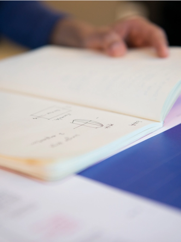
Uncovering the true differentiator
Achieving a successful design solution required aligning the company’s vision with its tremendous history. Southwest had long stood for freedom, but our research pointed to something deeper. It has always treated every passenger equally. This led to the insight to focus on what makes the Southwest Airlines brand great: its emphasis on people first.
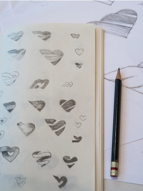
Breathing new life into a classic symbol
In this examination, we identified the most potent symbolic asset: the heart. While always a part of the brand’s identity, the heart had become overused, with hundreds of variations. We chose to use the heart to make a bigger statement and, in doing so, helped it become a truly iconic symbol.
In 2014, Southwest claimed the humble but bold heart as its symbol, crystallizing a business philosophy 47 years in the making and showing the world that what started Southwest is exactly what will lead it into the future—treating people more like people.


Building a visual system with heart
Complementing the new Southwest logo is a redesign of the brand’s livery, airports, and website. From planes to snack packaging, the refresh is modern but true to Southwest’s DNA: confident, authentic, and full of personality.
“The Heart emblazoned on our aircraft, and within our new look, symbolizes our commitment that we’ll remain true to our core values as we set our sights on the future.”


“Overall, I think this is one of the best airline redesigns we’ve seen in many years. There is a clear pride in it from Southwest… It’s almost rare for a company to have this much confidence in a rebranding launch.”


Flying higher
Immediately following its evolution, it was blues skies for Southwest. The brand was named airline of the year and top investment pick of 2014. Not only did the airline have a 95 percent appeal to Southwest flyers, but it also saw a seven percent increase in consideration among business travelers as well as an increase in brand commitment among the general market.
Lippincott has continued to work with Southwest through the years to show that a little heart goes a long way, from creating a comprehensive UX design system to crafting a campaign for the brand’s 50th anniversary. All of which are meaningfully grounded in what makes Southwest special: putting people first.


