Taco Bell
Going all-in on brand evolution
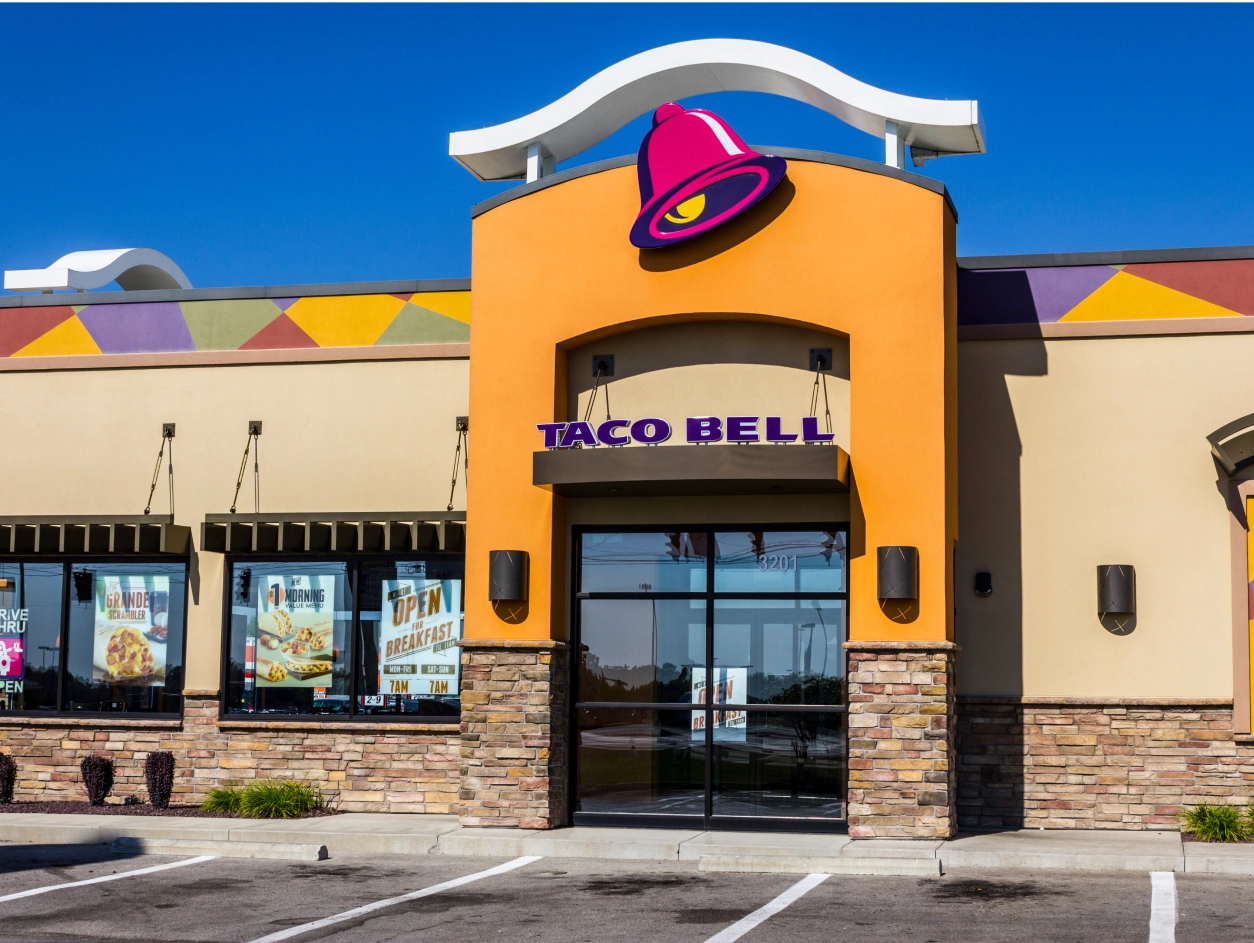
The fast-casual restaurant segment had evolved, with brands vying for the savvy millennials who demanded more from their food experiences. Despite its continued restaurant and menu innovations, Taco Bell’s brand identity had remained largely unchanged for over two decades.
It was with this challenge that it engaged Lippincott. Our objective was simple: to help Taco Bell claim a leading role in this latest revolution and to create an iconic look with its signature, playful personality.
We started with an exploration of the bell, deciding on a visual streamlining of this beloved icon. But simplification doesn’t mean generic, bland or undifferentiated. By opening up the bell, this instantly recognizable shape can now be filled with an endless array of patterns, textures and images. We then paired the icon with a simpler, more approachable and more modern expression of the name. From digital channels to commercials, billboards and beyond, the sans-serif font heightens legibility across all touchpoints.
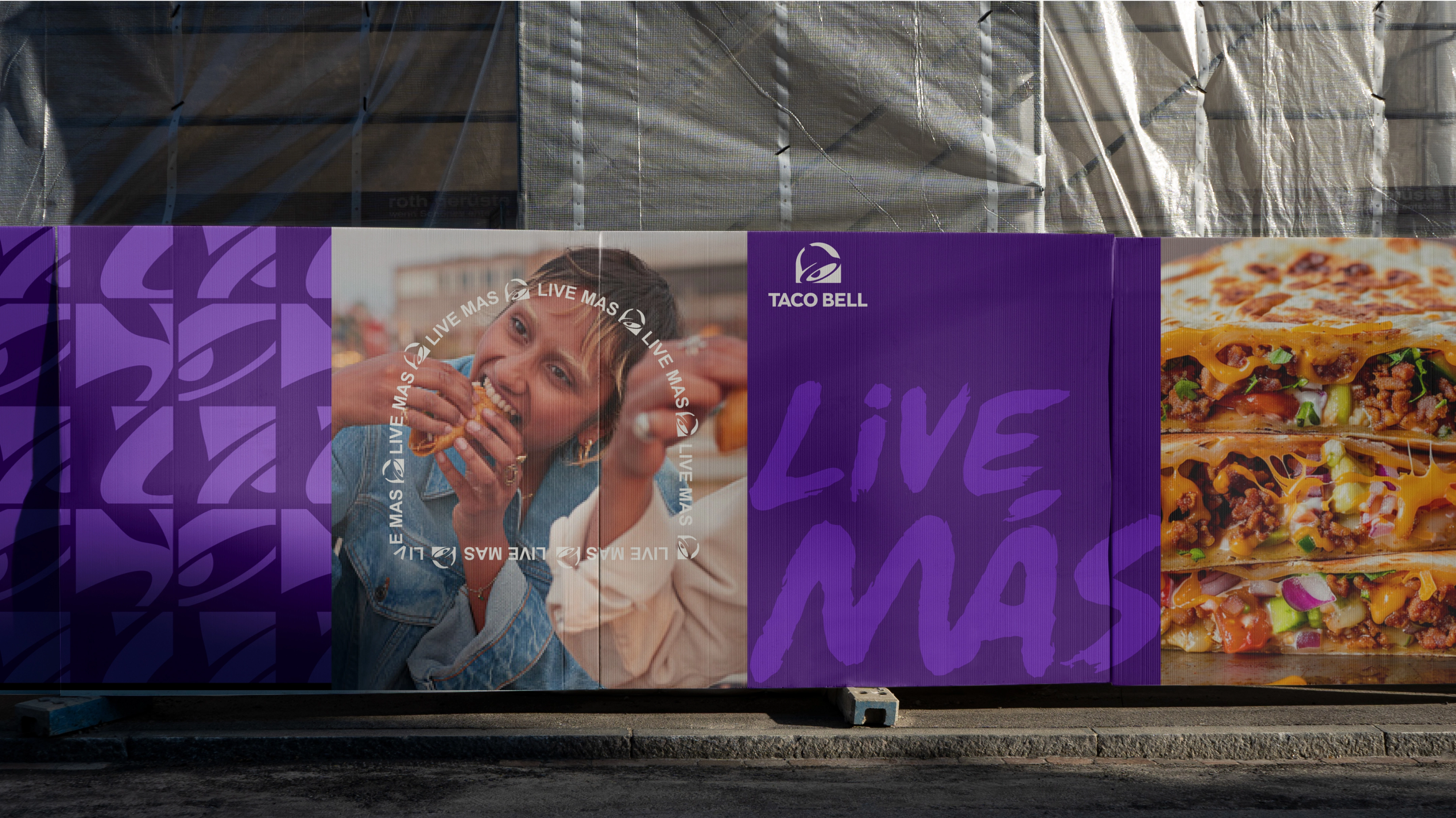
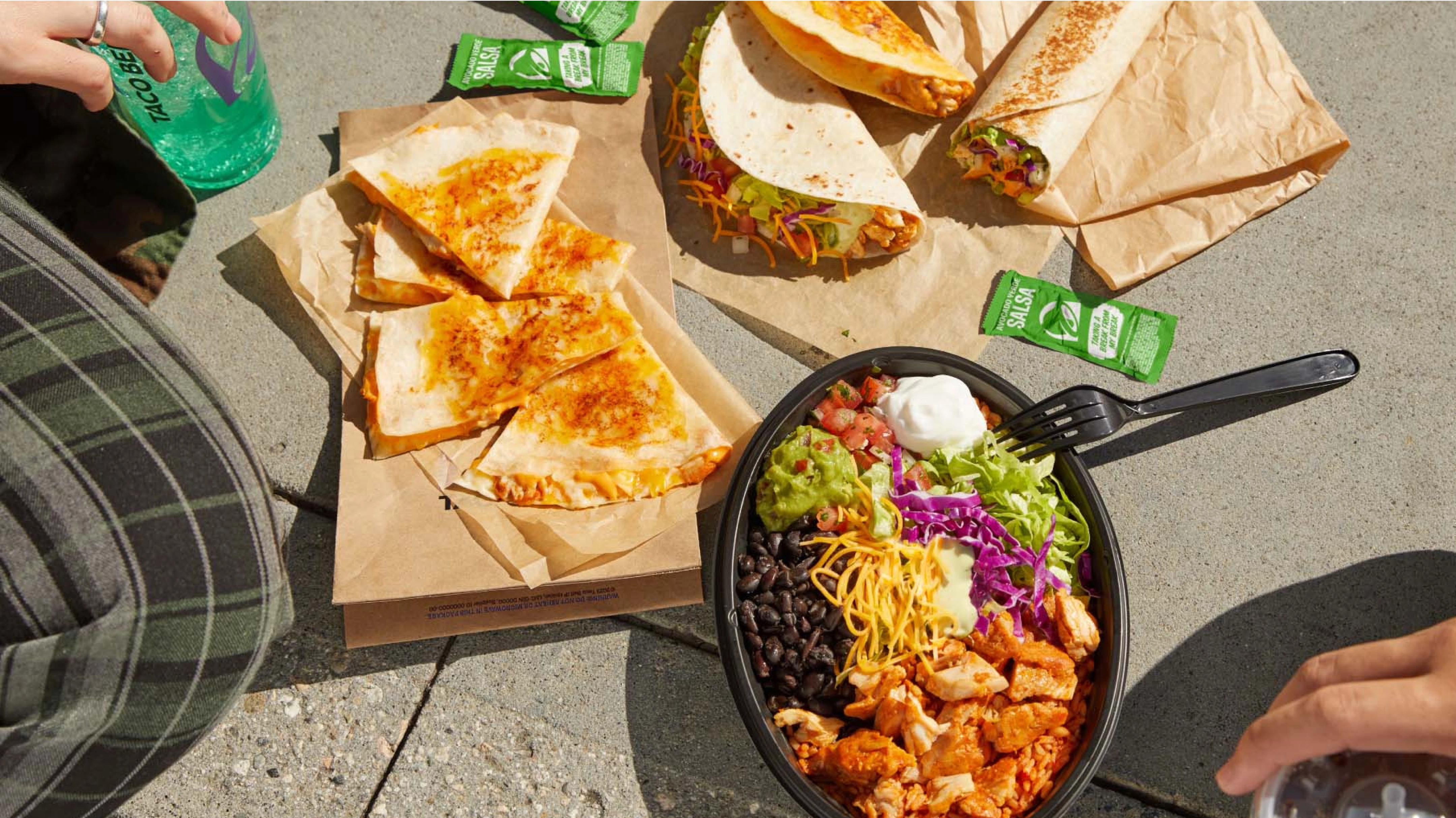
The new design celebrates the brand’s heritage with a fresh new palette of seven vibrant color combinations. The blend of color and pattern provides greater usage flexibility — from neon to queso and Texas to Taipei — while maintaining Taco Bell’s iconic framework as it continues to build new cultural ground.
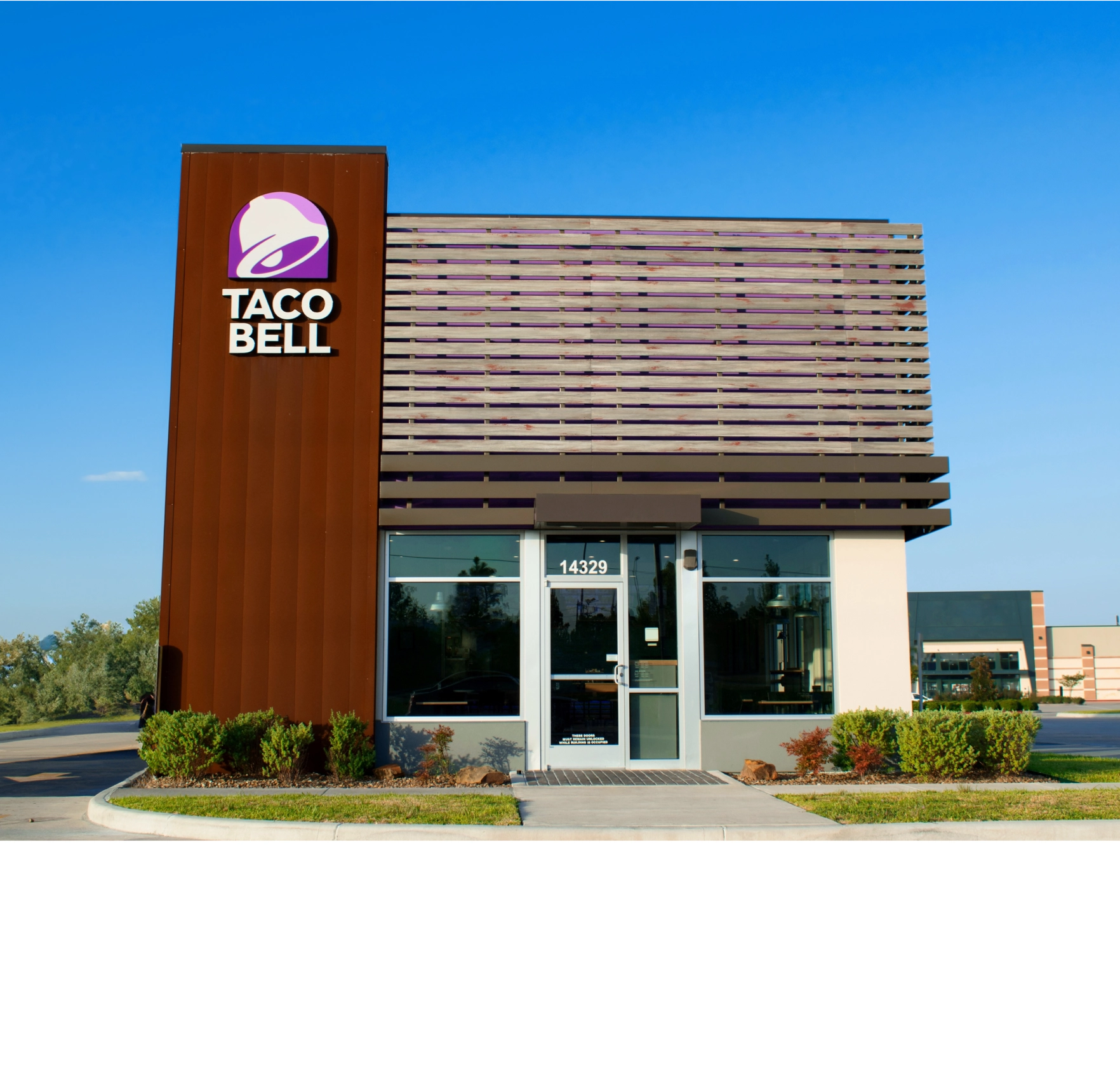
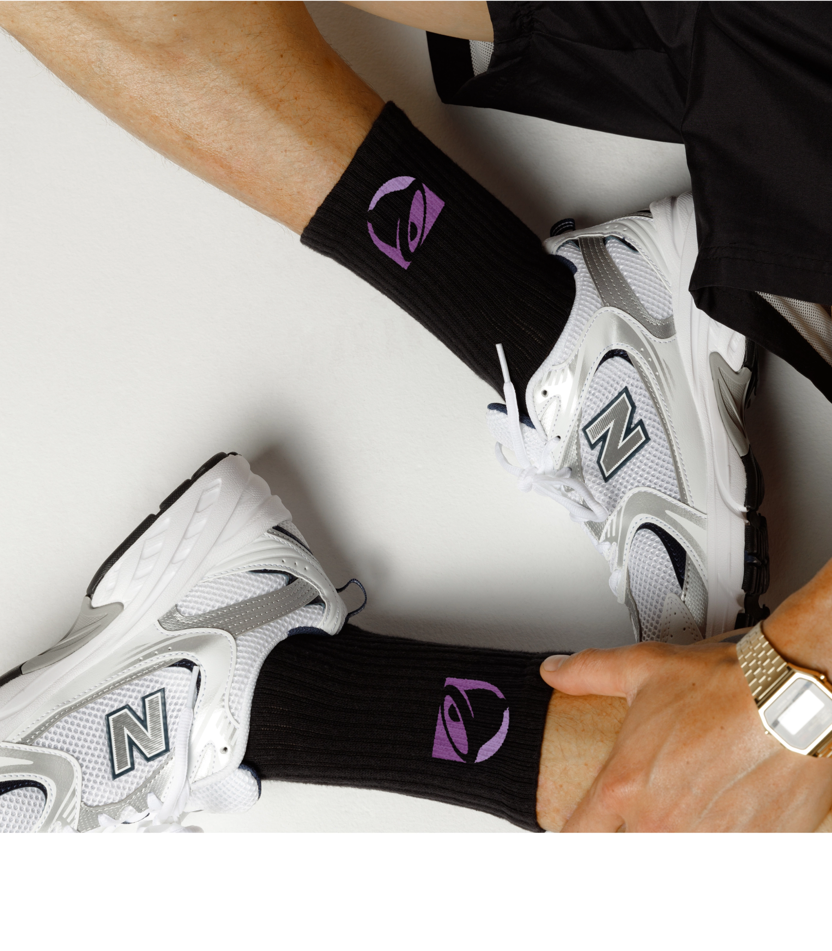
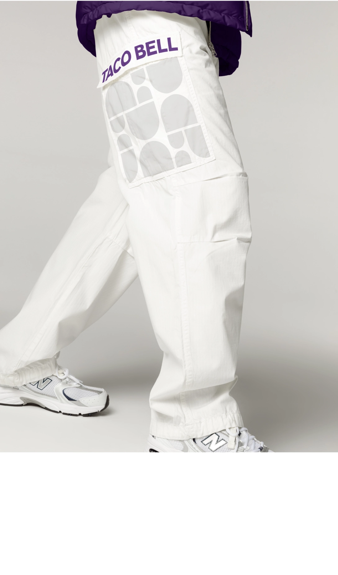
The logo marks the beginning of a new era for Taco Bell. Emblazoned on everything from slushy cups to merchandise to the glowing sign at the door, the logo serves as Taco Bell’s beacon as the company pioneers new restaurant experiences and pursues its growth plan to become a $15 billion brand by 2022. Live Más indeed.
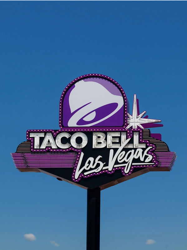
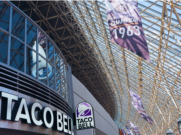
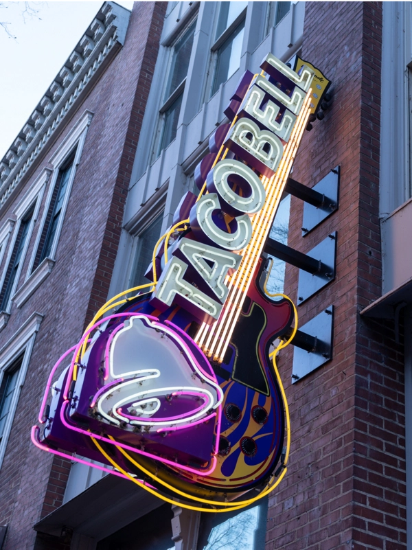
“As a marketer, the honor of updating a logo for an iconic brand like Taco Bell is a once-in-a-career opportunity, and I couldn’t imagine a better partner in Lippincott. Their vision and partnership allowed a dynamic and evolved brand identity to shine through and reflect the innovative brand we truly are.”

