Standard Chartered

Evolving a historic brand for success in a digital age
An opportunity to evolve
Standard Chartered has been on the cutting-edge of financial expertise across the world’s most dynamic and diverse markets for over 160 years, with headquarters in London and a unique footprint across Asia, Africa, and the Middle East. They have a rich legacy of evolving their capabilities to meet and exceed client needs across diverse markets, but recognized that their existing brand no longer reflected their aspirations or ongoing digital transformation. This, coupled with the need to connect with a younger generation of wealth creators, sparked an opportunity to evolve.
Lippincott partnered with Standard Chartered on a full-scale evolution to develop a digital-first brand that communicated the full breadth and power of its network, drawing in new audiences and inspiring the bank’s existing base across the globe.
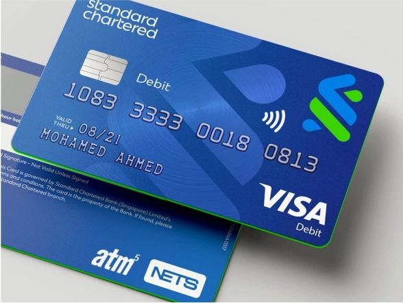
Modernizing and adapting an historic symbol
We maintained the “Trustmark,” Standard Chartered’s symbol for over 50 years, but redrew it to be simpler and bolder. Along with a redesigned wordmark, the optimization works across many dimensions, modernizing the brand while retaining the bank’s visual equity.
The new adaptive visual system was built to flex across a vast, ever-changing world of content, formats, and platforms. And since Standard Chartered’s presence across diverse geographies and markets has led to regional, informal monikers for the brand, the symbol acts as a beacon to drive recognition and consistency wherever it’s seen in the world.


More than money
The evolved brand also champions the bank’s commitment to sustainability by elevating the “here for good” promise, giving it a contemporary visual treatment that complements the logotype.
Along with the refreshed colors, a bespoke typeface, digital design system, new brand voice, and a people-first, culturally relevant photography style, the new design principles allow the bank to flex where needed according to region, client, or partner.


“We turned to Lippincott’s teams in London, Hong Kong, and Singapore for the combination of strategic rigor and creative excellence to solve a complex problem; as a dynamic bank growing through digital transformation, how can we reinforce our prime-relationship with clients around the world?”


Architected for growth
Following the refresh of the visual identity and a rigorous engagement across stakeholders, we developed a future-facing brand architecture to enable the ongoing evolution of the bank’s propositions and assist in further propelling Standard Chartered to become a Go-to Brand.
The new Standard Chartered brand was revealed to the world in February 2021 to an enthusiastic response, with reinvigorated employees rallying around the new brand.