NYC Pride
Celebrating Pride with an inclusive brand identity
How does a community fuse a heritage of activism and celebration through an iconic identity? Heritage of Pride, a nonprofit born from the events of the Stonewall Uprising, has cemented itself as one of the foremost LGBTQIA+ Pride organizations over the last 30+ years. The organizer of the iconic NYC Pride March, The Rally, and other marquee events, its legacy is one of unity, protest, advocacy, and, of course, fun.
However, the organization and its trademark event, NYC Pride, had an inconsistent brand identity that changed each year to reflect the event’s annual theme. The Heritage of Pride leadership team recognized that to drive equity and awareness around the organization’s incredible impact, it needed an identity that endured.
A partnership of purpose
Eager to support an organization so dear to many team members’ hearts, Lippincott worked hand in hand with the Pride team. Together, we created a new brand identity for NYC Pride that zeroed in on the unique role the organization plays for many in the LGBTQIA+ community—one that told a story of inclusivity and showcased that NYC Pride is more than an annual celebration. It uplifts the community 365 days a year.
An inspiring new positioning
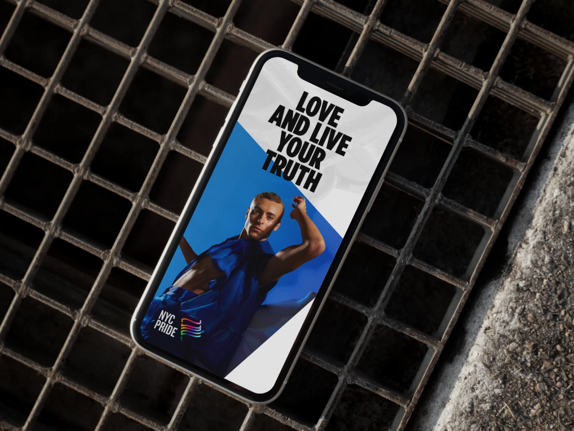
Our goal was to represent NYC Pride’s significance more powerfully in New York and around the world. Our first step? Create a new positioning that would act as a foundation for the brand and experience. The new brand purpose, to inspire and empower every LGBTQIA+ person to proudly love and live their truth, speaks to NYC Pride’s roots in protest, and the annual celebration’s power in unifying and advocating for its community. To support this, we crafted four key commitments that outline what the brand delivers to its audiences, both internal and external.
A dynamic new identity
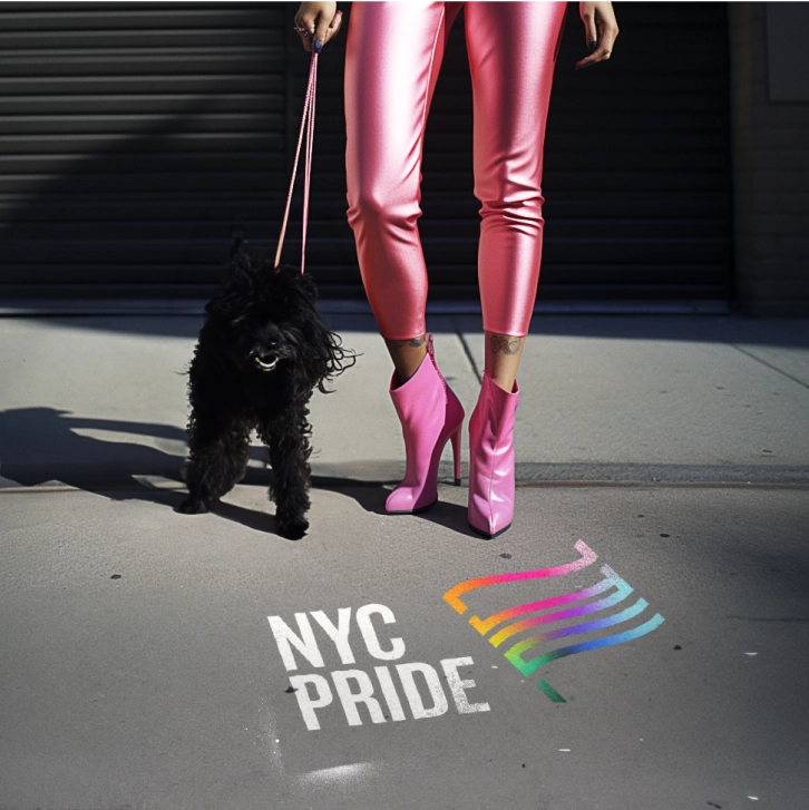
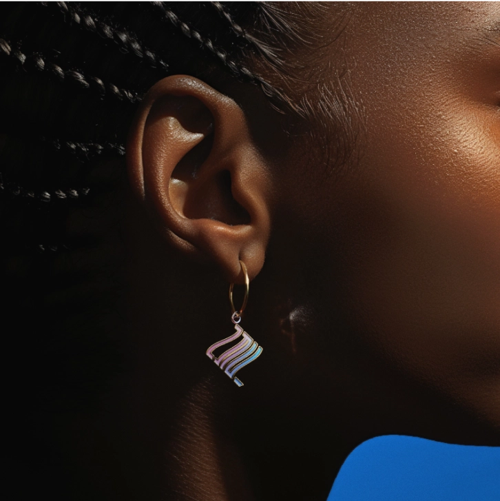
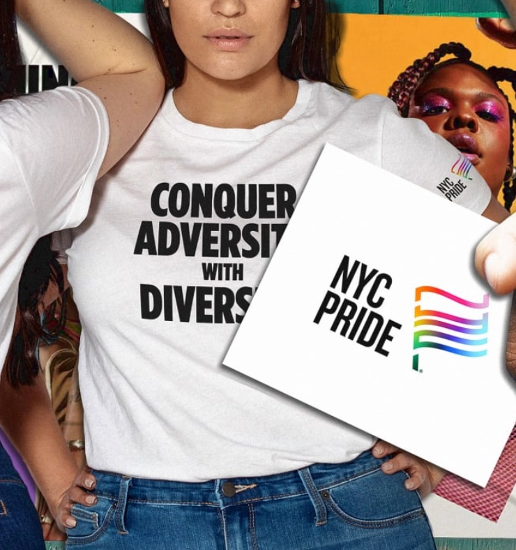
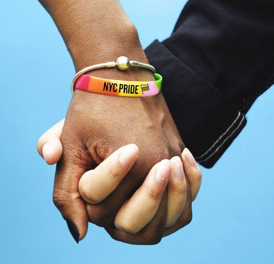
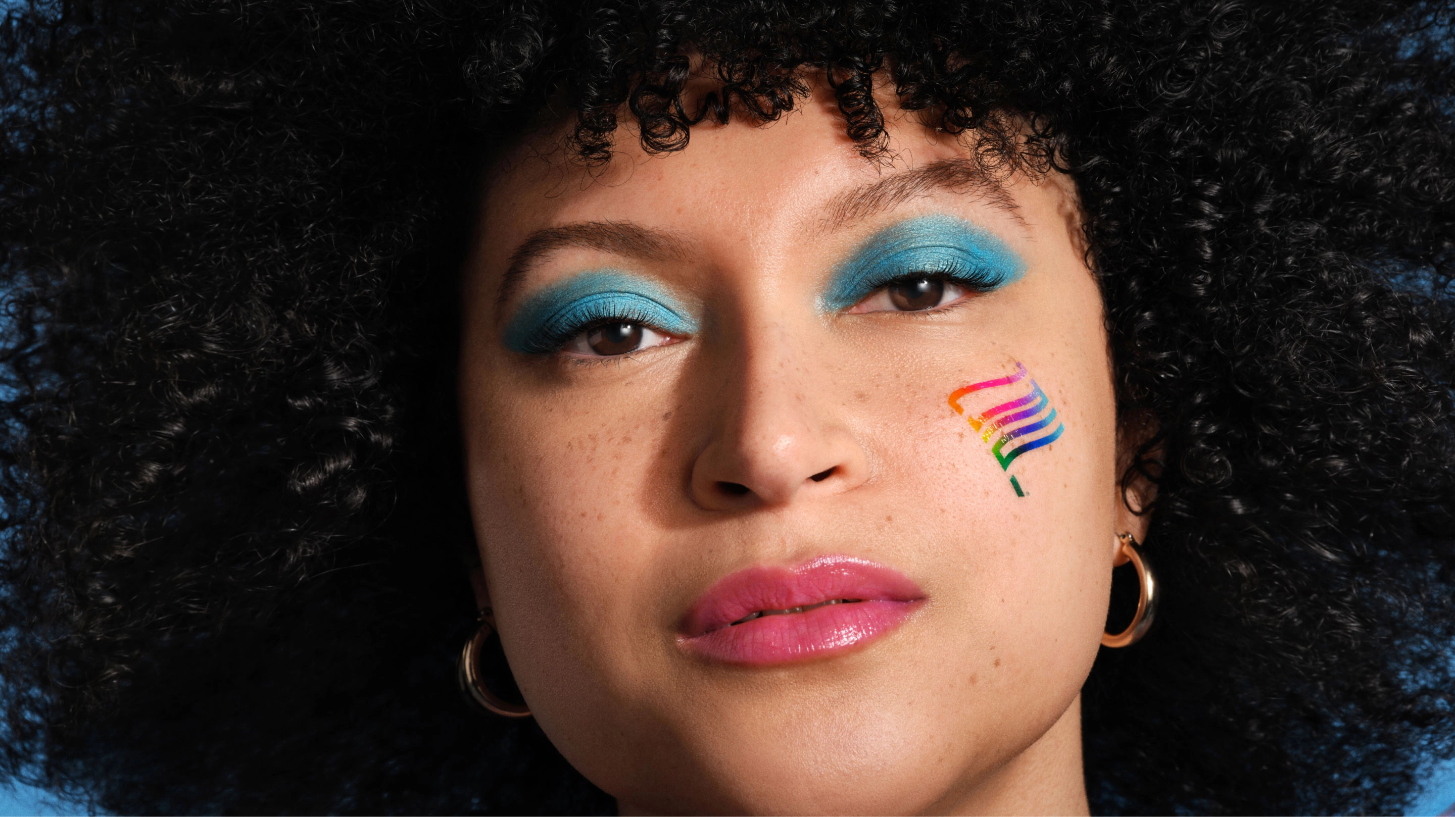
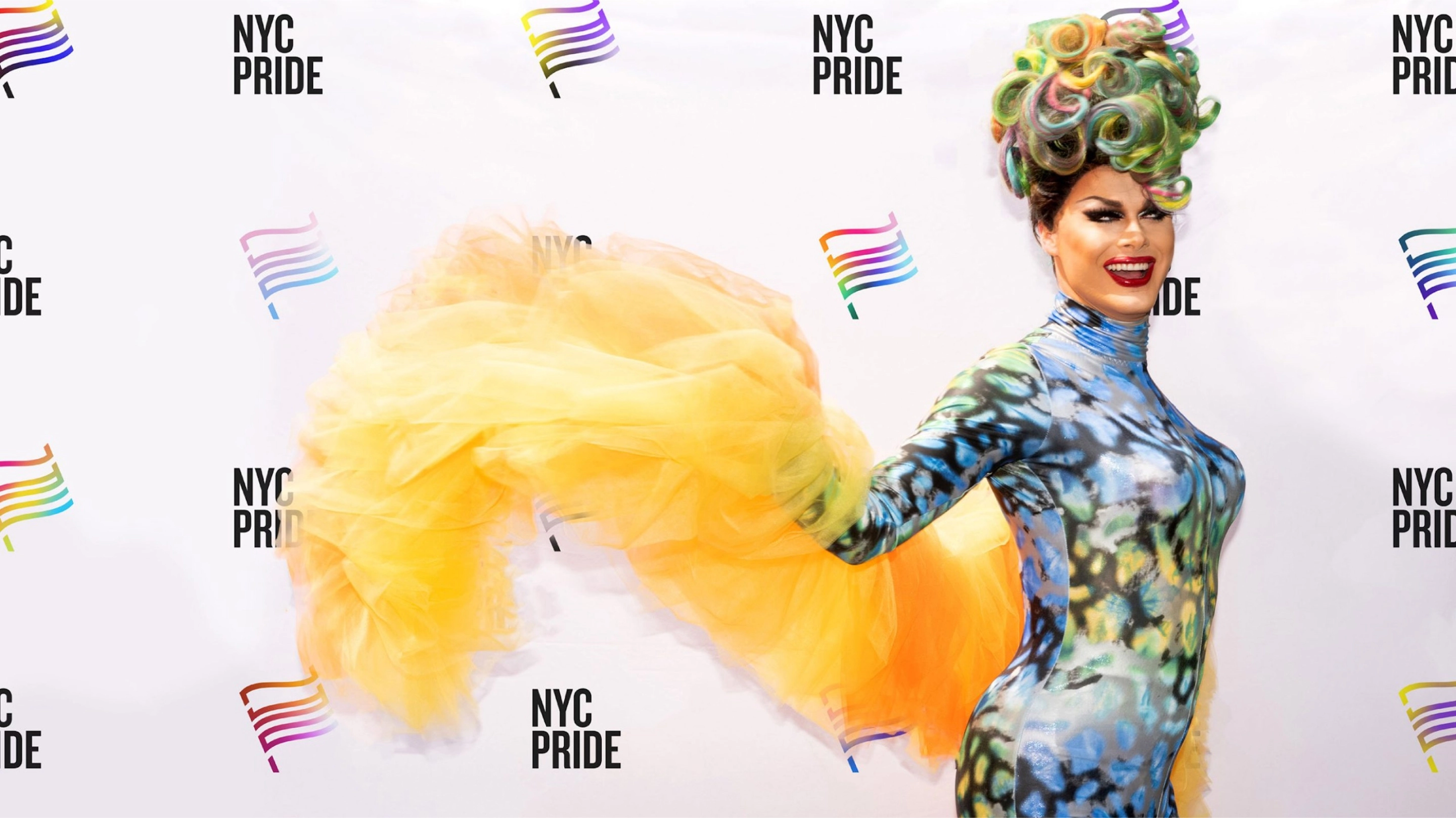
The new visual identity features a community-centric and identifiable flag emblem—one that is steeped in both history and current-day meaning. The iconic Pride flag, which has become known as a universal symbol of safety, community, and allyship, is at the center of the identity, capturing the brand’s spirit of celebration and activism. The flag subtly features the letters ‘NYC’, and features an adaptive gradient, providing storytelling flexibility and inclusivity for different subgroups within the LGBTQIA+ community.
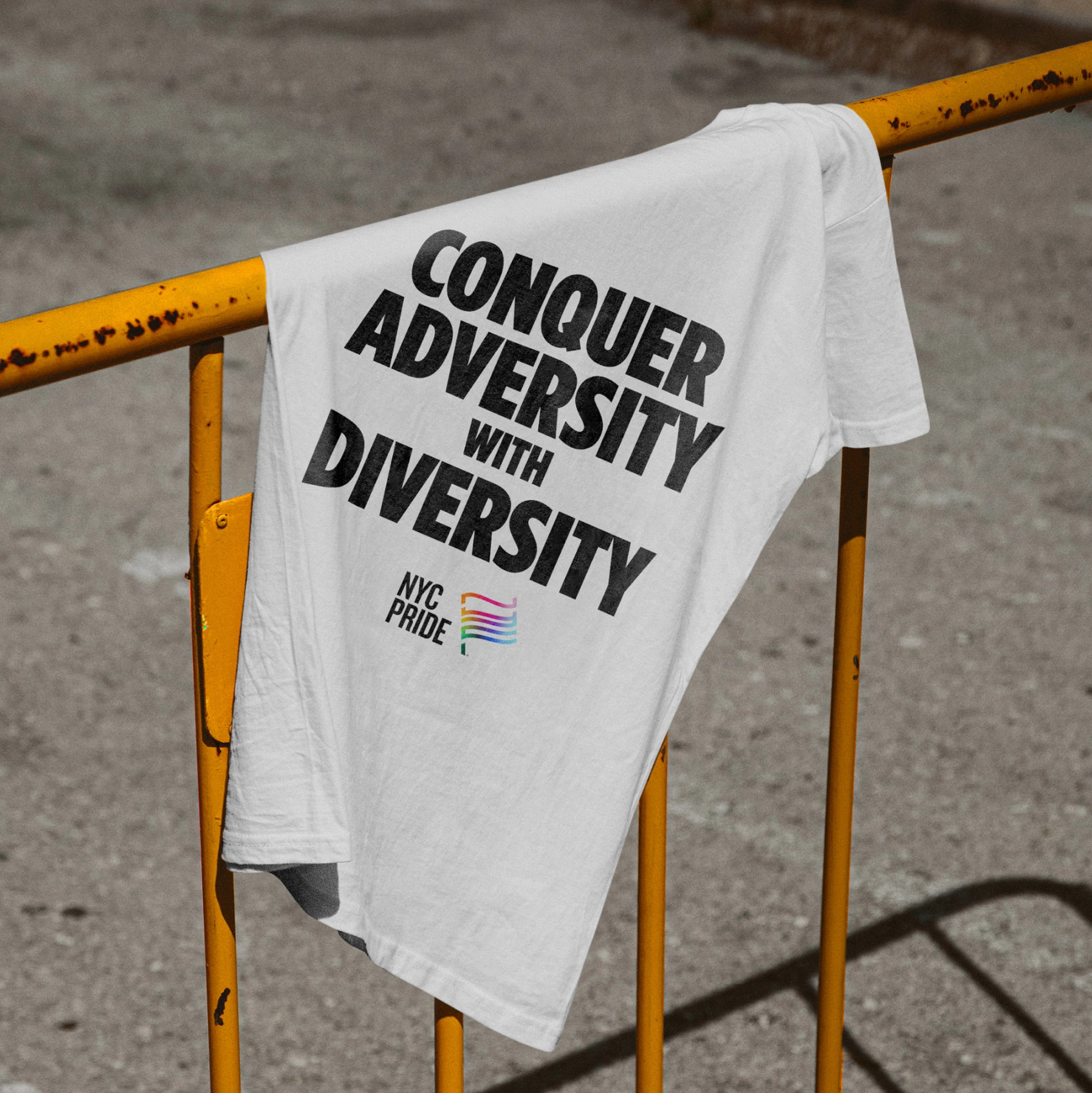
The symbol is paired with Monotype’s Knockout and Gotham font families, both designed by NYC-based Hoefler&Co., paying homage to the city in which the organization was born. Knockout, with its roots in the eclectic typography of 19th century broadsides, perfectly counterbalances the friendly openness of Gotham, a contemporary take on a style of sign lettering that is quintessentially New York and whose elemental forms were made to express as broad and inclusive a range of voices as possible.
More than just a logo
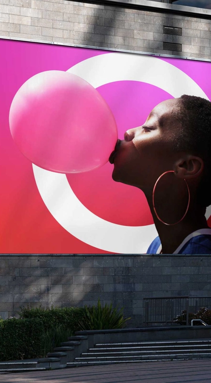
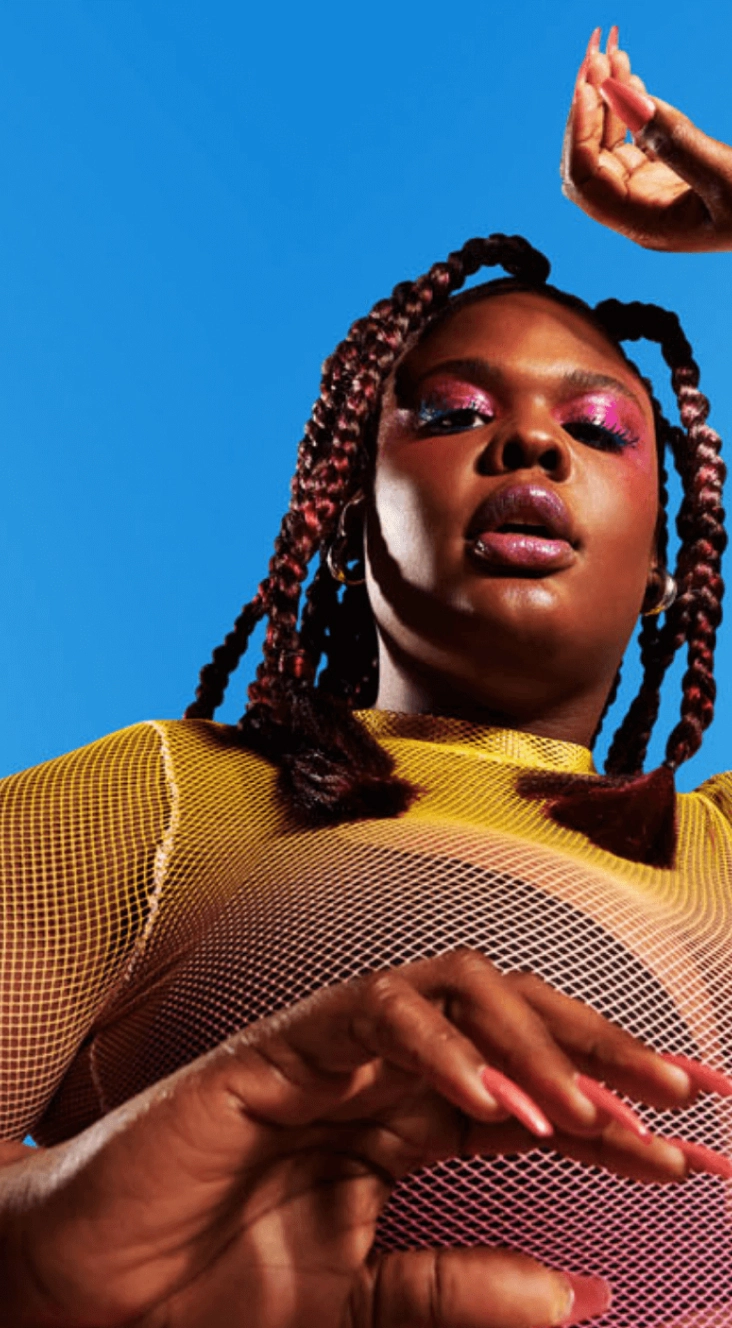
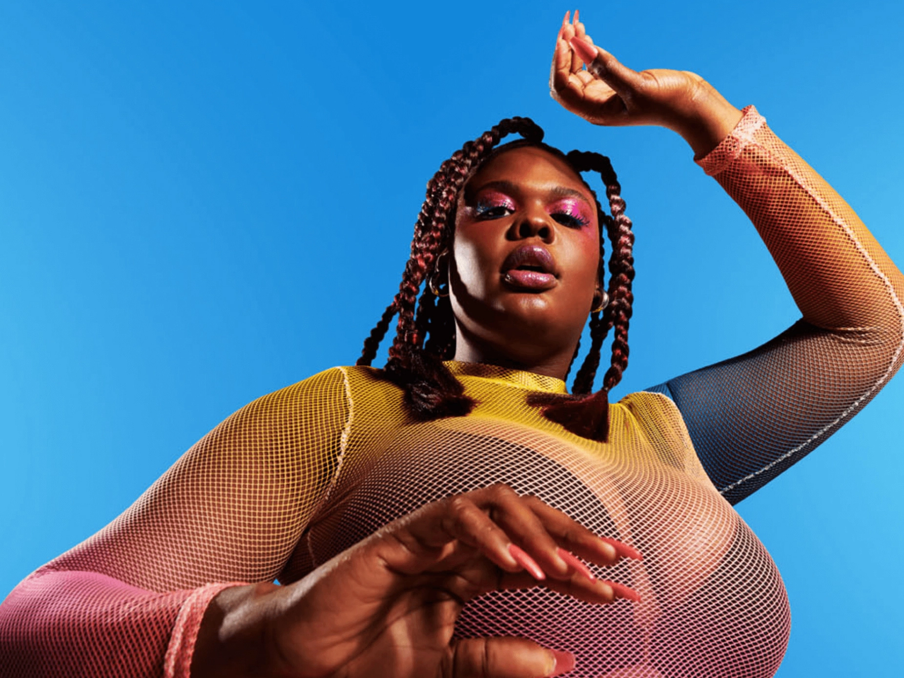
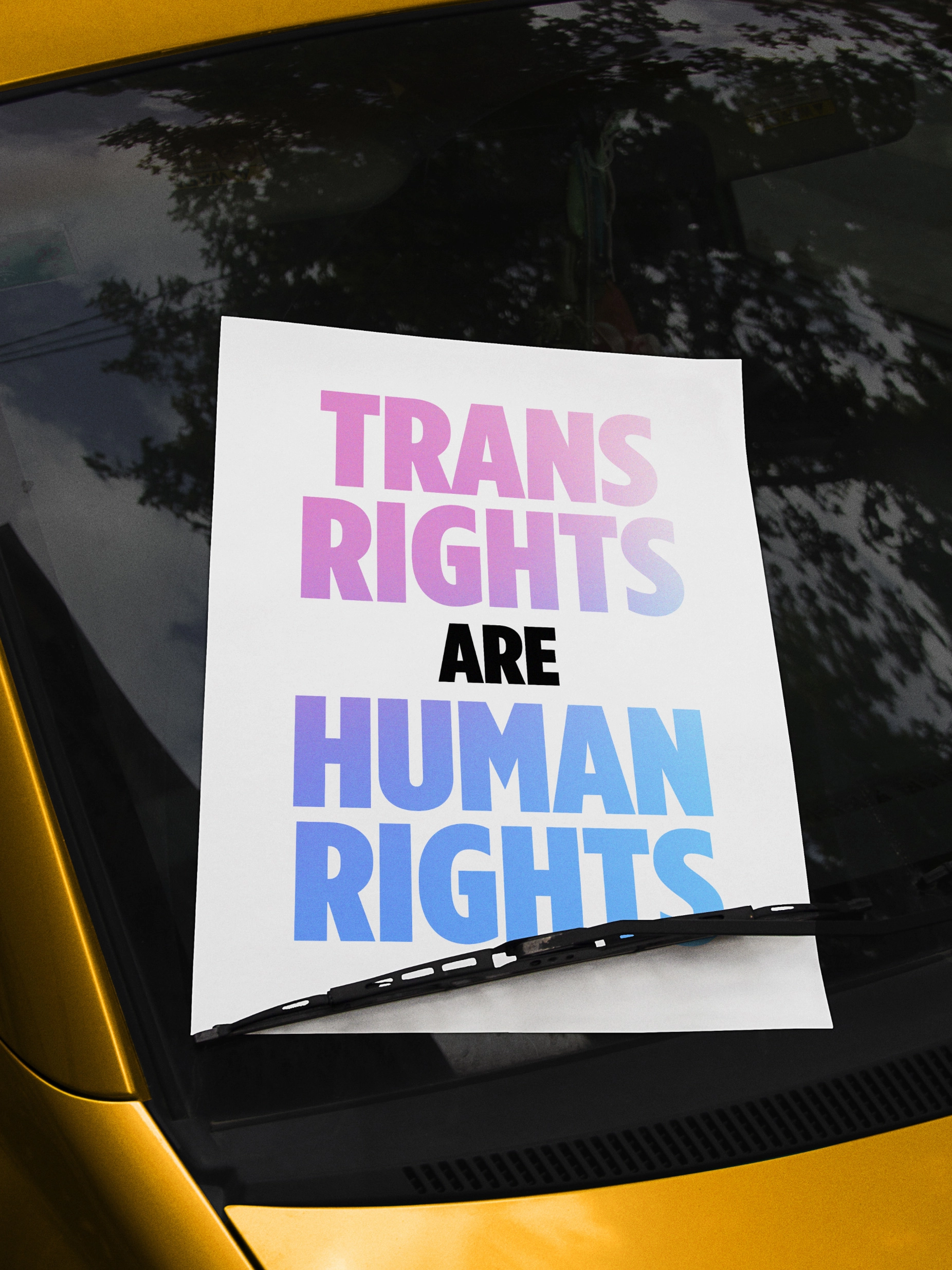
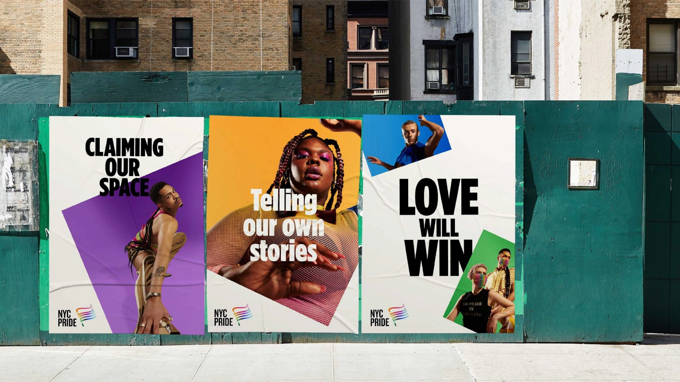
The supporting visual system is bold and direct. It is designed to stand out across varying environments and adapt to evolving annual campaign themes. It lends the brand flexibility to consider tone and context, dialing up exuberance when needed in celebratory events throughout the year, but also leading with a strong, clear voice in moments of reflection and protest.
Empowering a vital community
The evolved NYC Pride brand launched to the world on February 15, 2022, coming to life across platforms, including its website and social media channels. Moving forward, the new brand will underpin how the organization works with staff, members, and volunteers, foster new and deeper connections with the community and partners, and ultimately enable the organization to do more in pursuit of its important mission.


