Elimini
Launching the new leader in carbon removals


Carbon removals is moving out of the lab.
Touted for decades, carbon removals is finally playing a real role in the fight against climate change. The next step? Scale. Enter Drax, the UK’s leading renewable energy producer, and their vision: to transform carbon removals into a world-changing reality by delivering at unprecedented scale.
To do this, they needed to create a brand new company, one that could inspire a movement and accelerate demand for carbon removals. Lippincott helped Drax to create and launch a new brand that focused not just on removing carbon, but on transforming the entire carbon removals industry.
?fmt=webp-alpha&qlt=100)
Transforming carbon removals into a world-changing reality
Working together with the Drax team, Lippincott identified a core insight on which the brand would be built: today’s carbon removals customers aren’t just removing carbon, they are creating an inflection point—their investment is scaling technology, moving us down the cost curve and moving humanity forward. And they have to do it while protecting nature and biodiversity, creating jobs, and supporting communities. This insight provided the foundation for a brand poised to transform carbon removals into a world-changing reality. We synthesized this into a succinct brand purpose: removing carbon for good.
We distilled this essence into a name that broke category conventions: Elimini. The coined word, which combines "eliminate" and "illuminate," clearly connects to our mission of eliminating carbon from the atmosphere while evoking positivity and hope by illuminating a brighter future. Its short syllables and repeated "/i/" sounds create a sense of pace and acceleration, while the softer consonants give it a more human and modern feel.
The visual identity encapsulates the notion of transformation through color, animated graphics, and imagery. In the new logo, cut letters in carbon-black illustrate carbon removal, while the constellation of teal squares symbolizes a coalition and collective action.
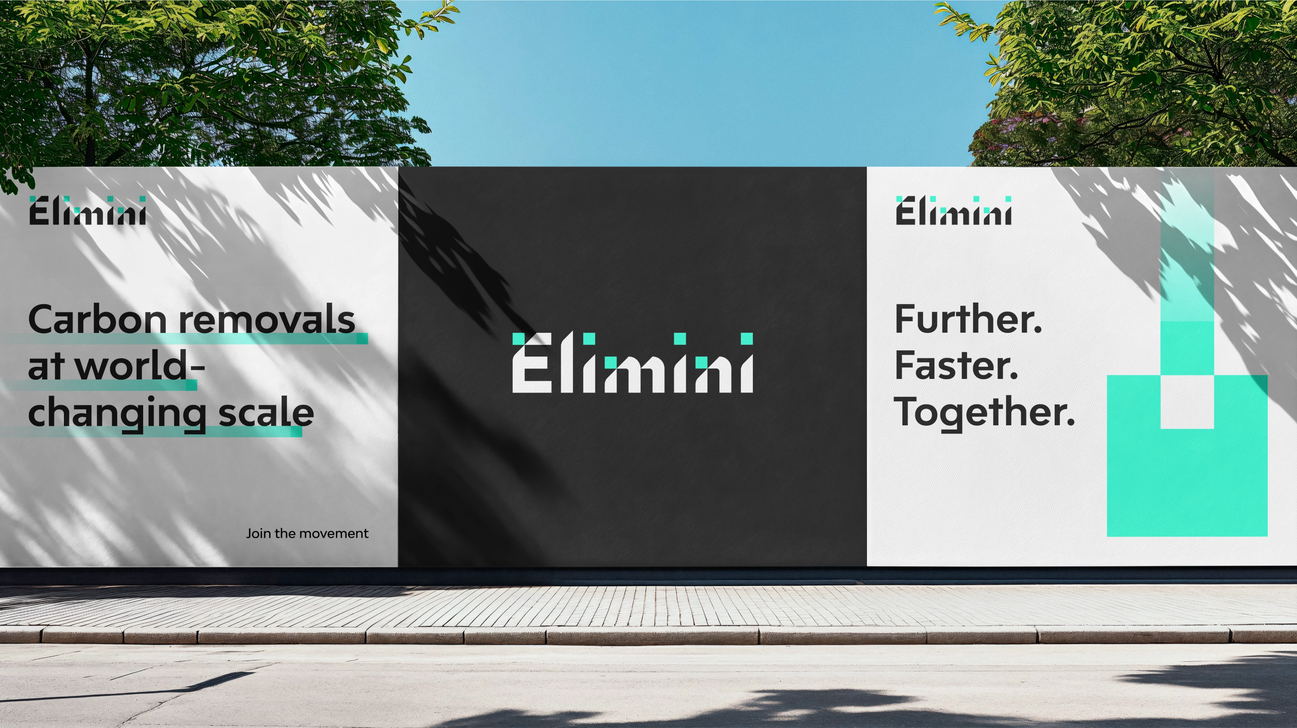
The visual system truly comes to life in animation, with the teal squares acting as transformers, representing transformation, coalition and unity. The color palette is deliberately stripped back, using white and carbon black for clarity, and “Transformateal,” along with secondary teal colors, to signify a clean, and improved future. The unique typography family aligns with this identity, featuring an engineered and precise look characterized by a blend of straight lines and curves.
Photography captures collectives in nature, industry, and society to emphasize the strength of unity.
MSQ, our advertising partner throughout this process, transformed the design into launch advertisements for Elimini during New York Climate Week in September 2024, positioning the new brand to lead the carbon removal revolution.





?fmt=webp-alpha&qlt=100)
