Modernizing a beloved media brand
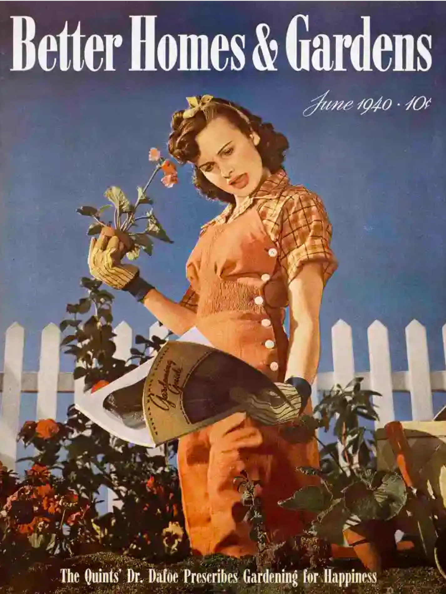
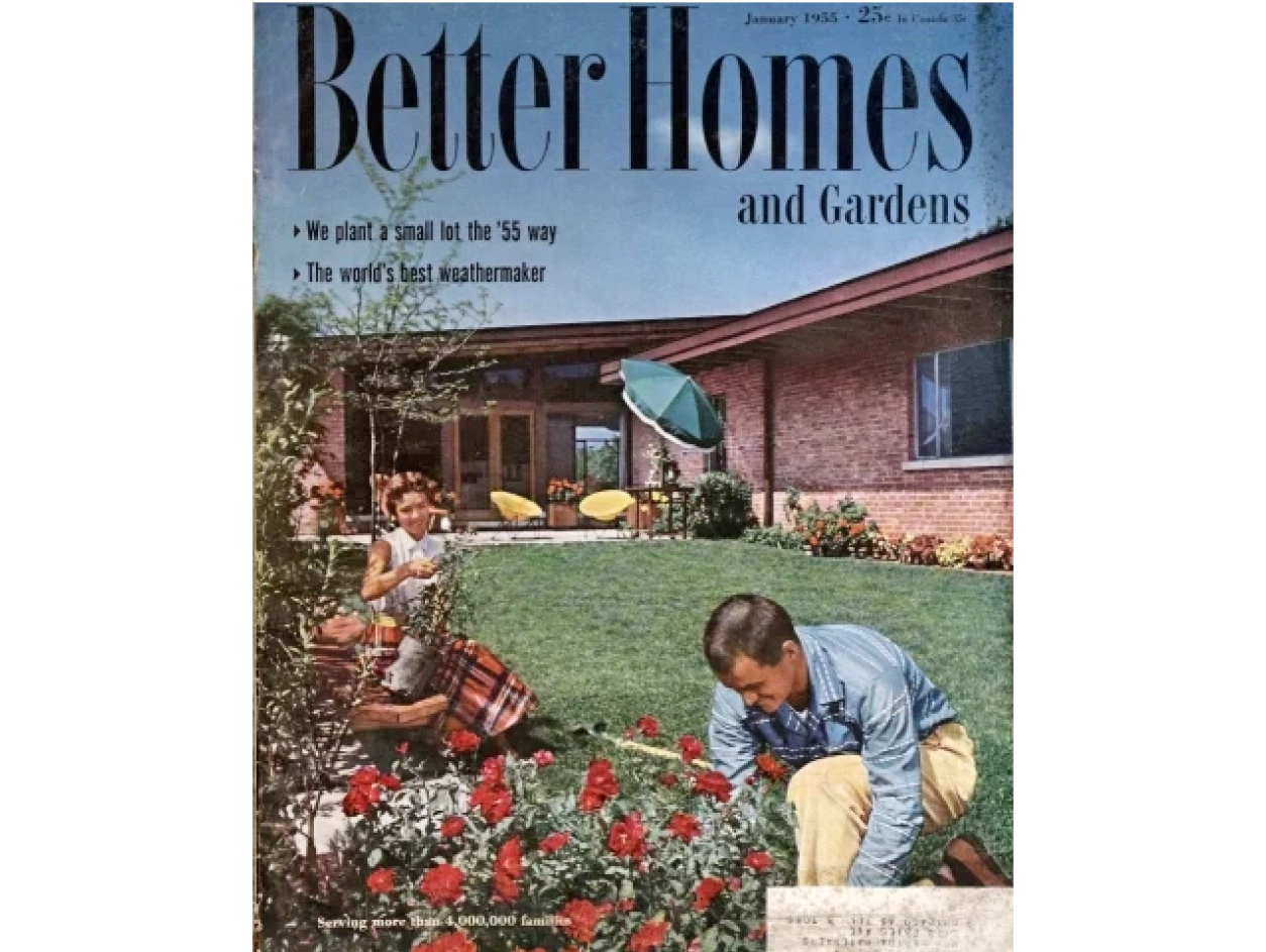
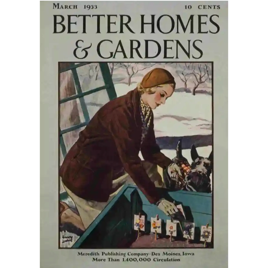
After 94 years since it first debuted, Better Homes & Gardens needed a brand built for today's modern world
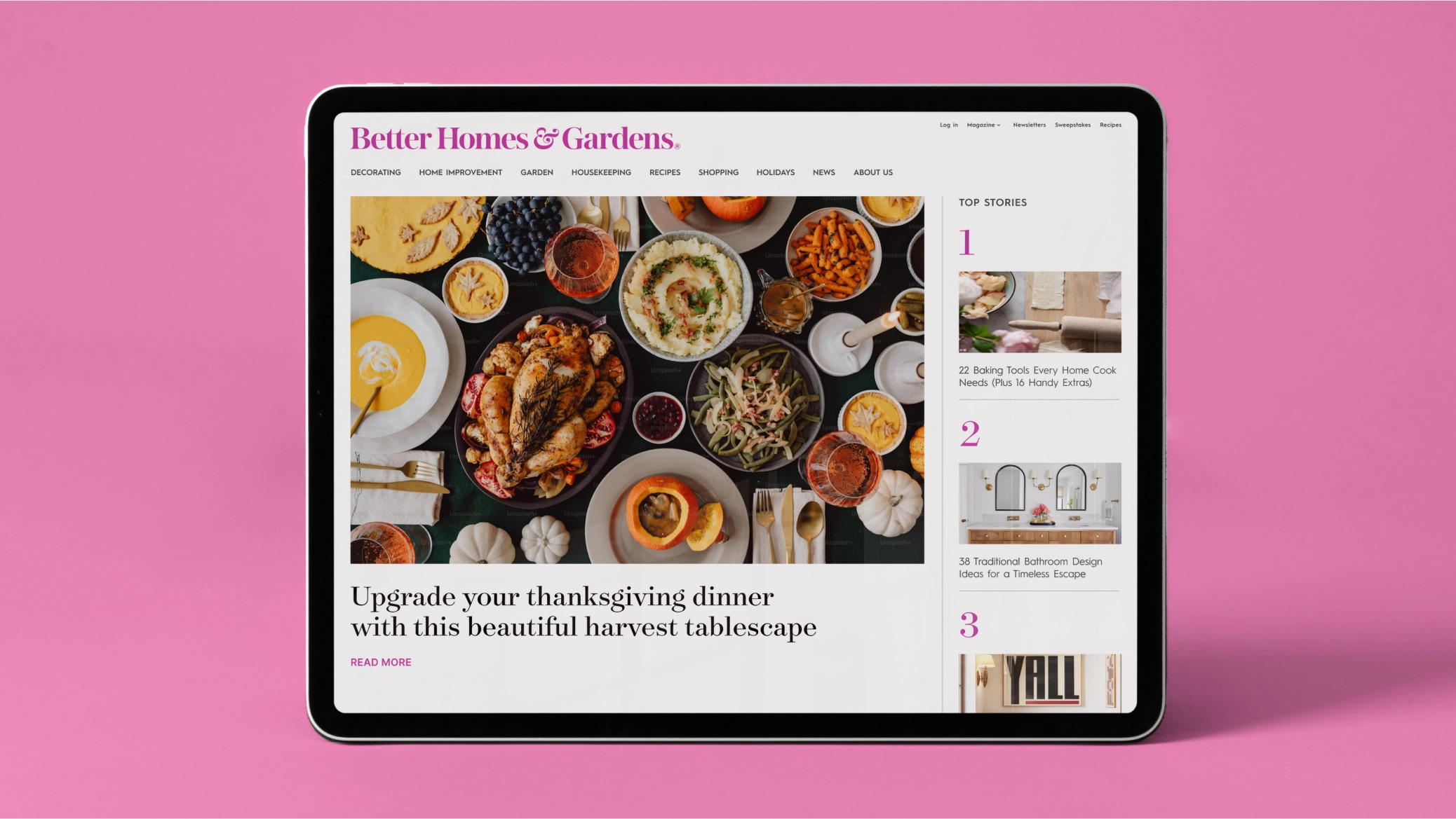
A challenging incentive for revisiting any iconic logo is the modern complexity of context. In the 94 years since Better Homes & Gardens first debuted, its context has radically changed from a magazine brand with a handful of related books to a highly complex system of digital, social and mobile platforms as well as a broad-based global licensing program.
This increased number of diverse platforms brought to light the limitations that came with the existing arrangement of the name and its use within digital, social and mobile channels. Not to mention the growing identity disconnect across the portfolio, including its global licensing program, that occurred when individual teams modified the logo for their own purposes.
This prompted the leadership at Better Homes & Gardens to call on Lippincott, the designers of the parent company Meredith Corporation’s current logo and identity system.
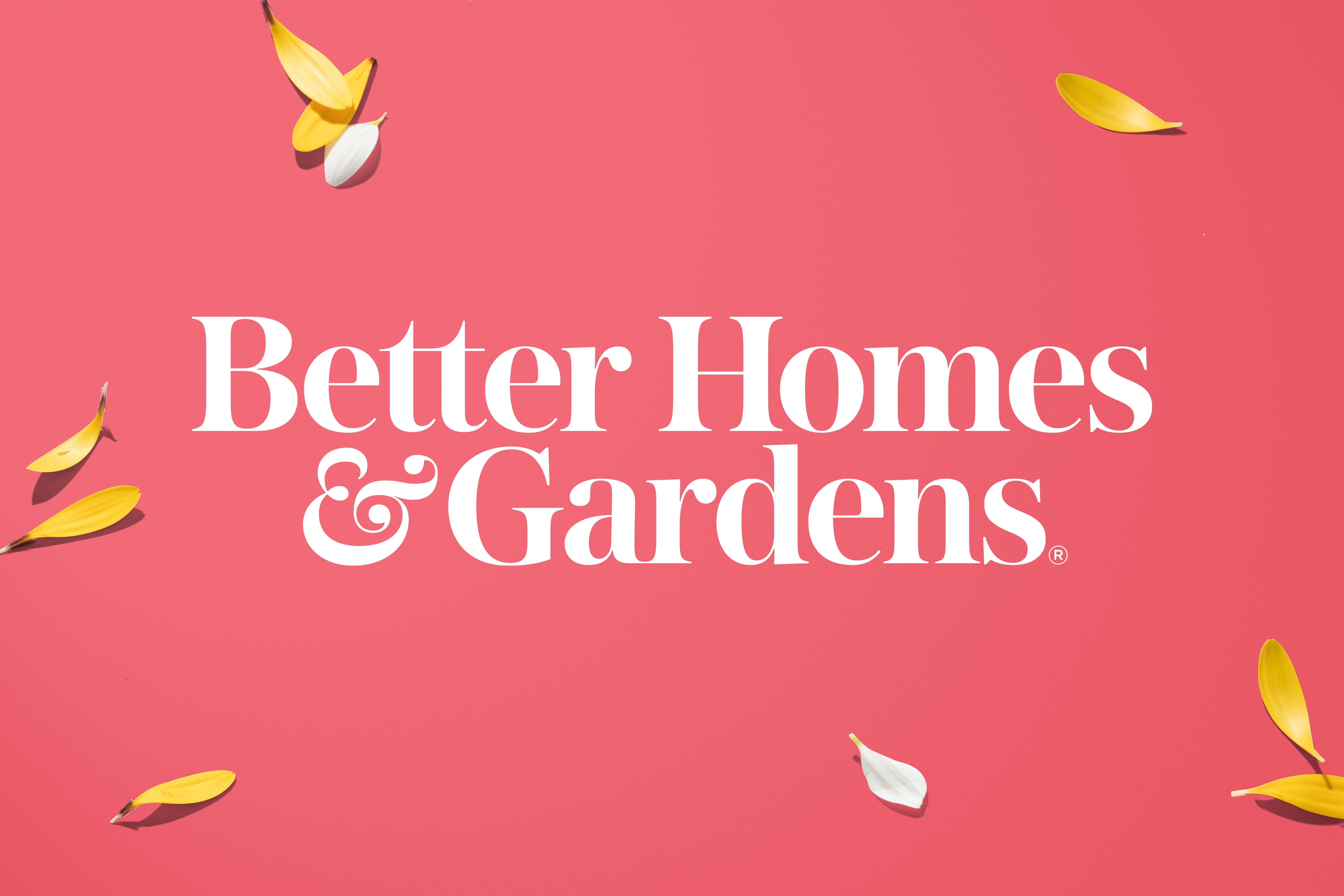
“We wanted to create a logo that can connect all Better Homes & Gardens platforms and extensions through a true identity system better suited for multiple uses, particularly in today’s rapidly changing digital environment. Thanks to the help of Lippincott, we did that and now have a logo for the next 100 years of Better Homes & Gardens.”
With 94 percent brand awareness, Better Homes & Gardens is a trusted source of inspiration for its 40 million readers.
In order to fully leverage this well-earned trust across platforms, the brand needed a flexible system with a strong core identity.
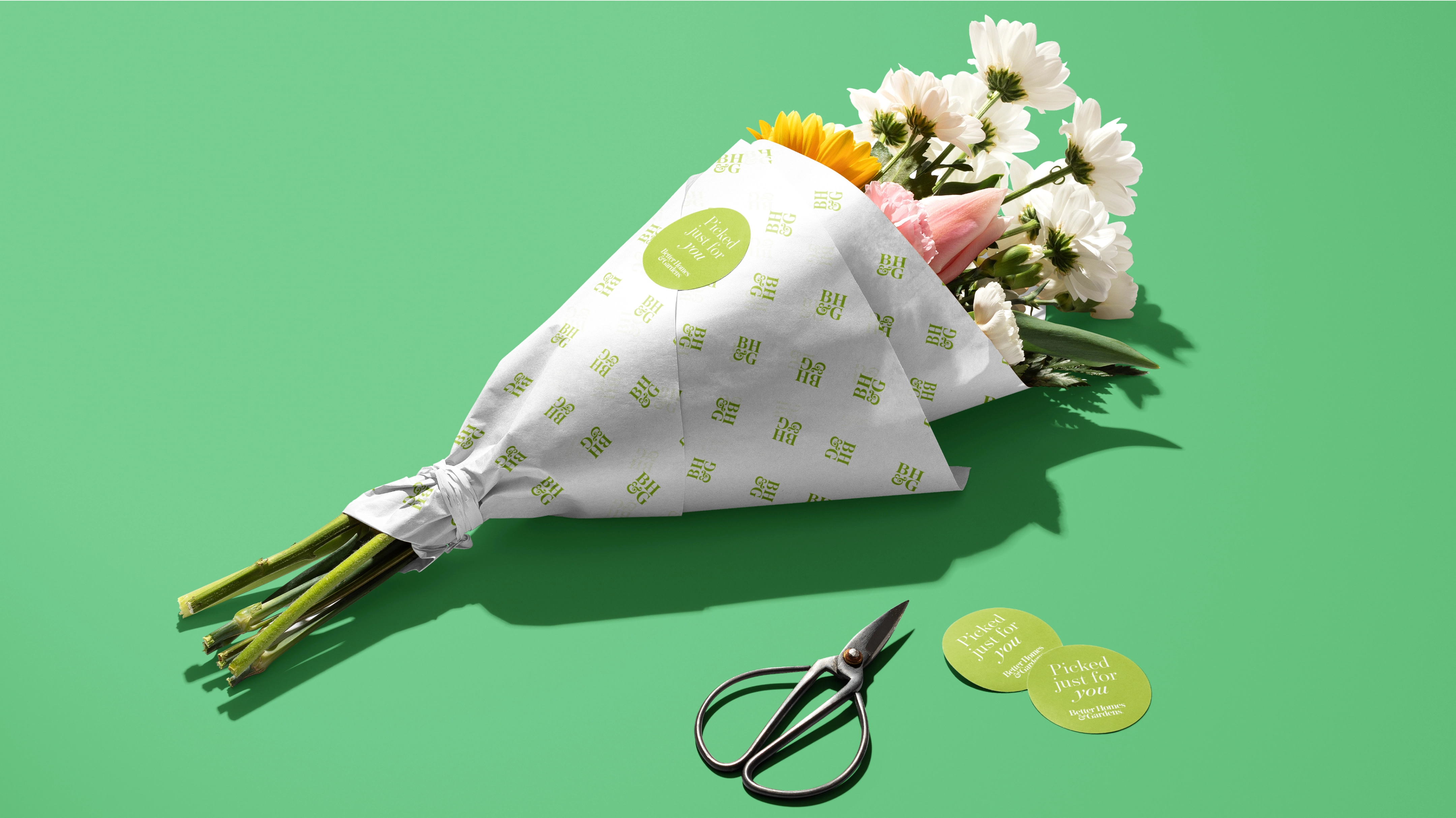
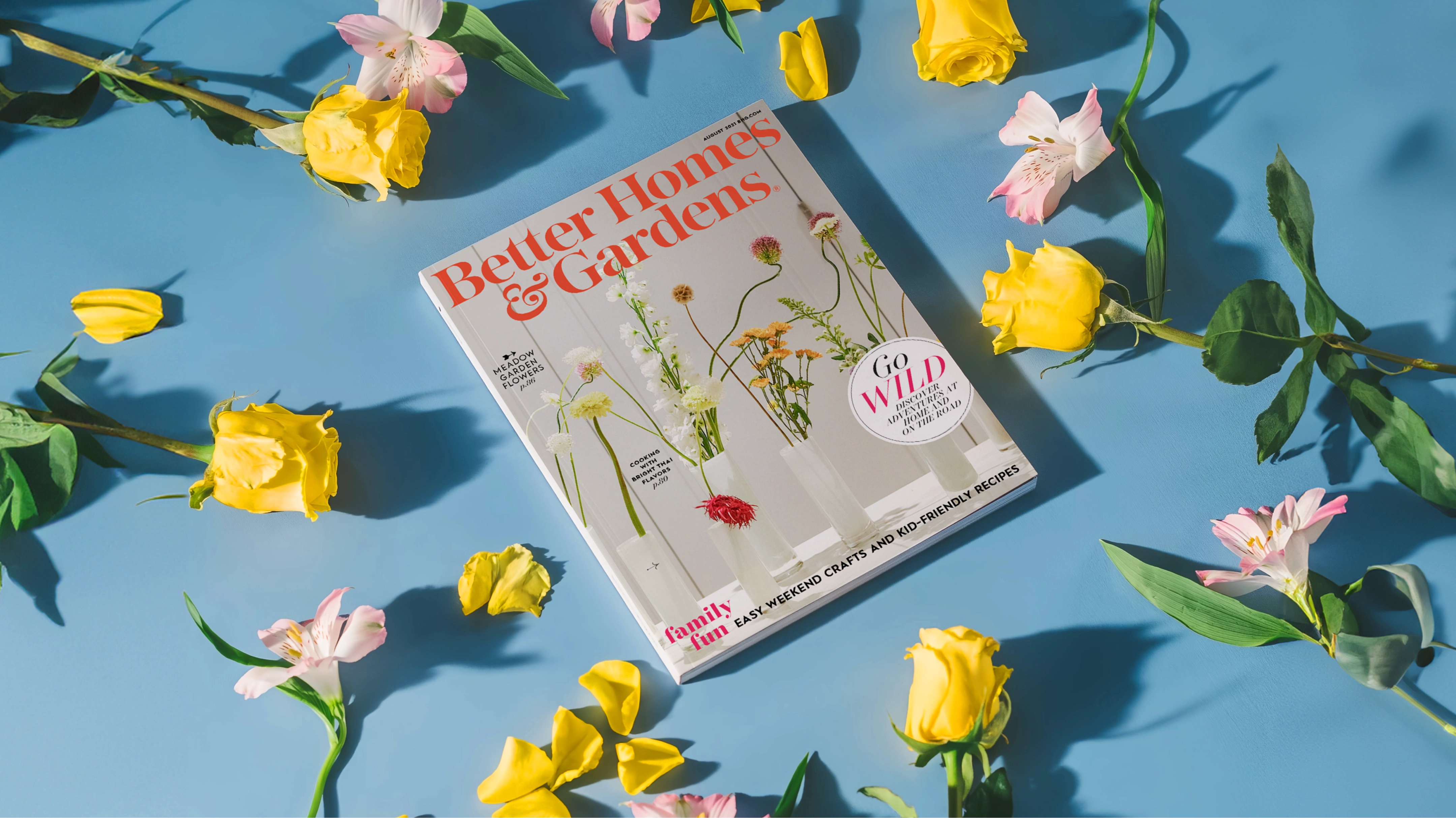
The new design is rooted in the brand’s heritage, but as a new, simplified expression ready to carry the brand into the future. It links all the platforms and extensions through a modern and adaptable identity system. And by creating a consistent, cohesive brand identity that is recognizable in print, online and in-market, we are able to give readers, friends and fans a greater connection and affinity to a richer Better Homes & Gardens.
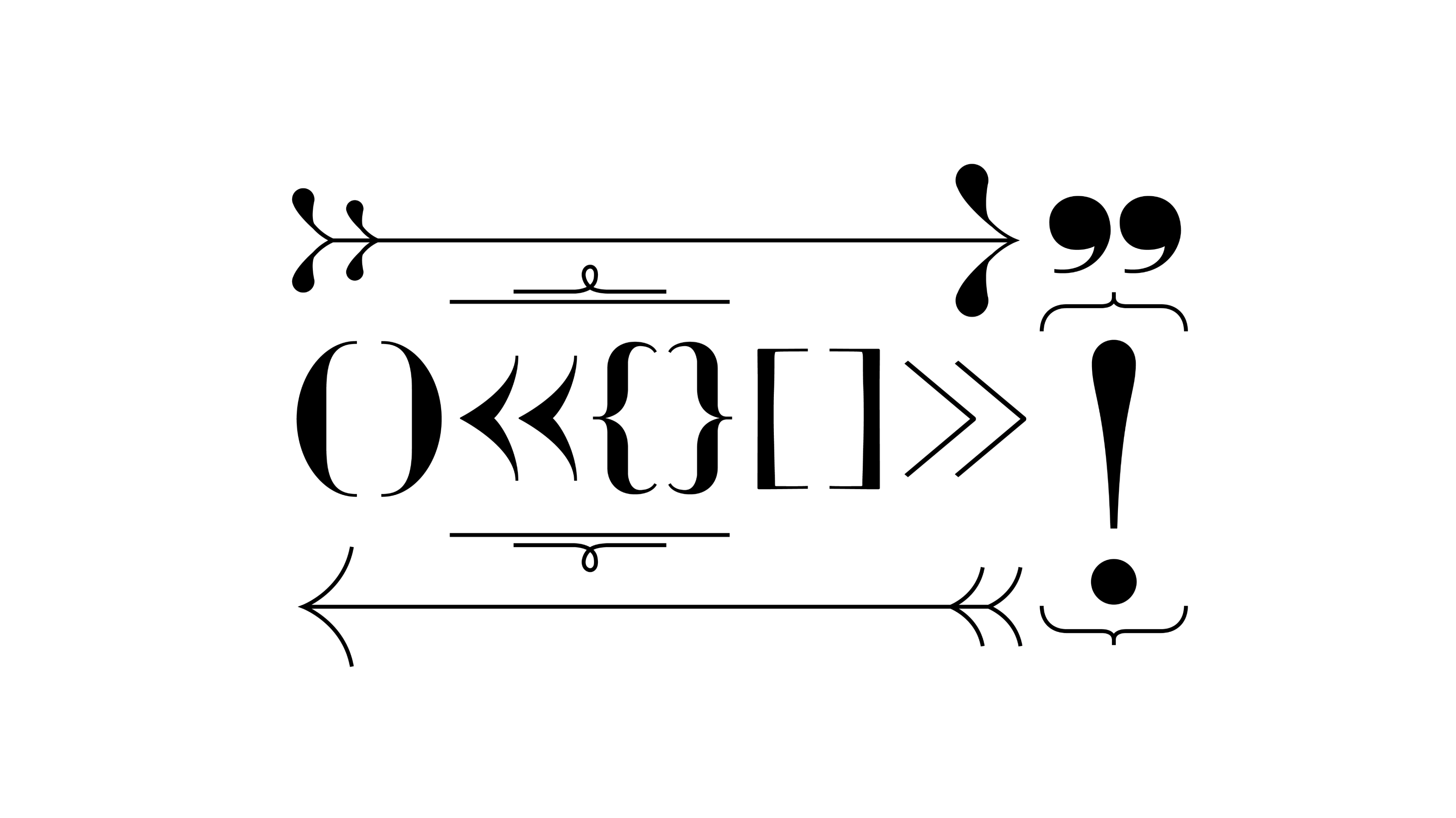
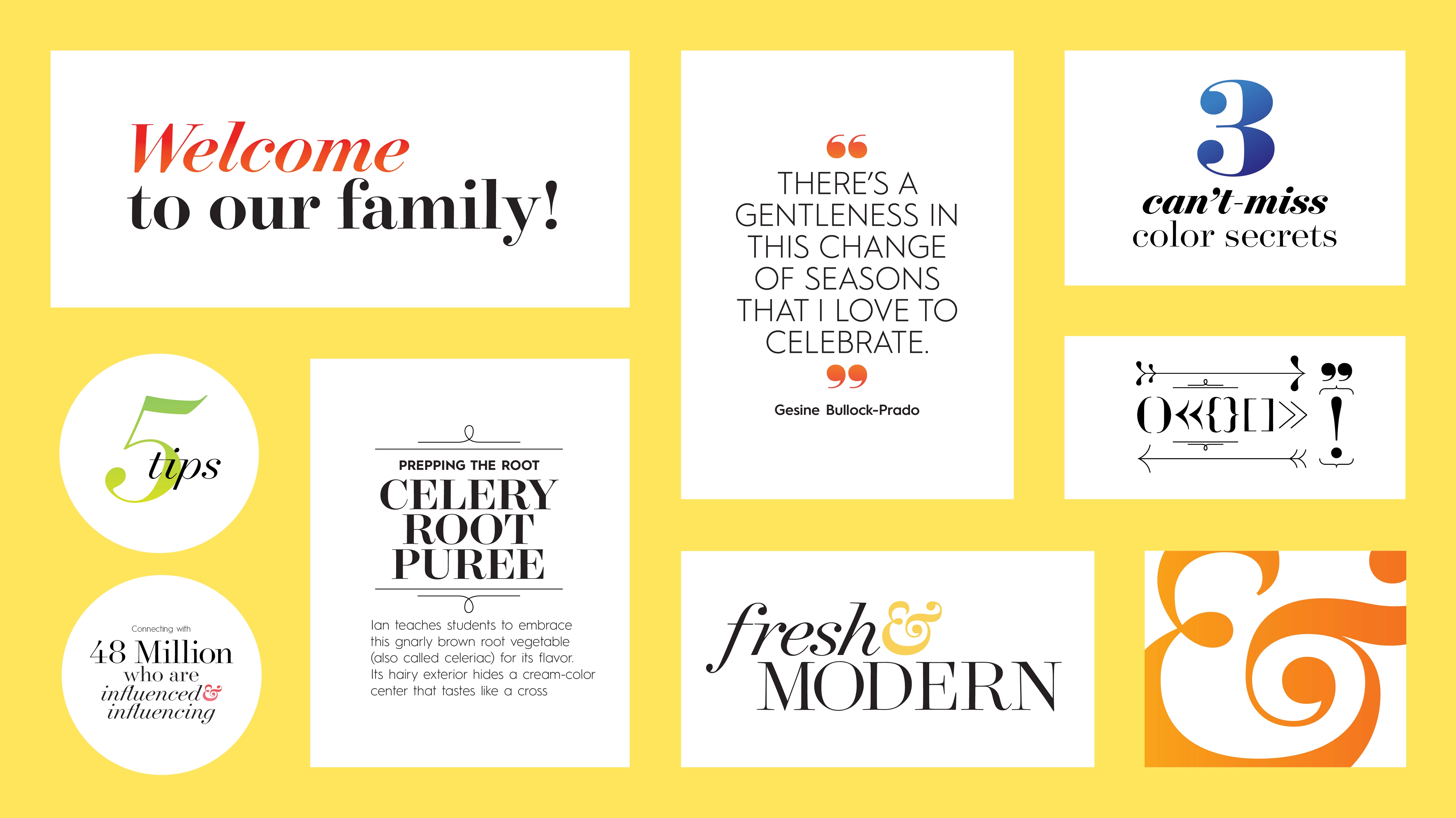
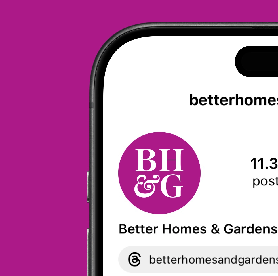
Central to the update is the return of the ampersand, which was used prior to World War II and before the magazine shifted to emphasize the postwar “home” element in the name. The new ampersand provides a distinctive visual cue that connects the brand’s assets while reflecting its creativity. For the design system, we created a toolkit that captured the spirit of the magazine while providing the flexibility to adapt across all the Better Homes & Gardens platforms.
This new logo is fully bolstered by a stronger, more cohesive visual system that allows Better Homes & Gardens to create connections across all its valuable communication channels.
