Adelaide University

A modern brand for Australia’s newest university

A sector immersed in disruptive forces
The higher education sector is at a pivotal moment, with an increasing number of non-traditional paths to success and disruptive technologies redefining learning. To remain relevant, universities must connect meaningfully beyond their campuses—in short, they need to harness the power of brand.
That’s why, when the University of Adelaide and the University of South Australia were poised to become a new university—Adelaide University—they turned to Lippincott.
The task: create a brand that serves as a strategic compass, guiding both internal and external experiences and differentiating Adelaide University among the world’s top-100 universities and Australia’s prestigious Group of Eight.
The vision was a brand that embodies both prestige and progress, blending the traditional, research-centric elements of higher education with the agile teaching needed to constantly upskill societies.
Setting the foundation
Working in partnership with Adelaide-based brand communication agency FULLER, which provided local context, our journey began with an in-depth research process to uncover opportunities for the new university. We conducted more than 45 interviews with leaders and academic experts from both universities, performed a rigorous global competitor analysis, and examined existing materials. With additional insights from a survey of thousands of current and prospective stakeholders in Australia and internationally, we unearthed a core insight: universities level the playing field for progress and catalyse change in people's lives and industries.
Adelaide University, with its mission to drive equity and inclusivity, embodies this ideal. Its brand needed to do so as well.
The big brand idea
We created a brand idea that would act as a North Star for all other elements and touchpoints of the experience: a Force for Firsts. It reinforces the role of the University as a driving force and catalyst of positive change, creating new opportunities and propelling individuals and industries to achieve their fullest potential.
The sentiment of enabling “firsts” is close to the heart of both universities—the University of South Australia was the first Australian university to articulate graduate qualities in the curriculum and the first to publicly commit to achieving reconciliation with Aboriginal Peoples. The University of Adelaide produced Australia’s first female prime minister and the first Australian to walk in space.
From this, we crafted a compelling brand platform, manifesto and design principles that balanced our core goals of honouring legacies and tradition while looking towards the future.
An expression where prestige and progress coexist
Higher education branding is heavily informed by category conventions established over centuries—and Australia is no stranger to that. However, no matter how simple or complex universities logos are, it’s the name that will always stand out in high-visibility applications.
With this in mind, we recommended a name-first design strategy to elevate Adelaide as a destination, both domestically and abroad, and place the brand in category by featuring the ‘university’ descriptor. That allowed us to explore visual expressions that pushed category conventions, capturing the uniqueness of the brand while retaining the stature of a storied institution.
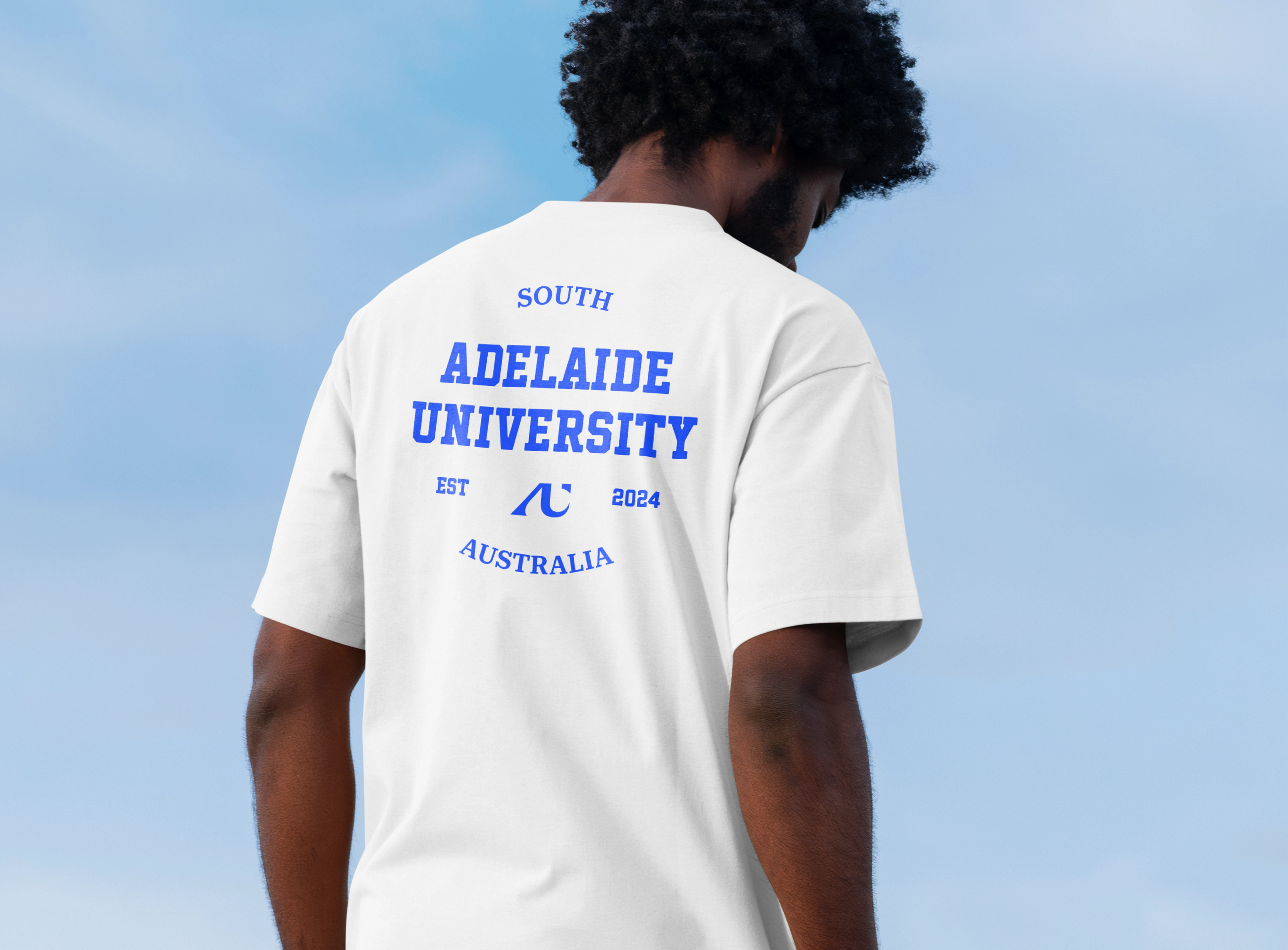
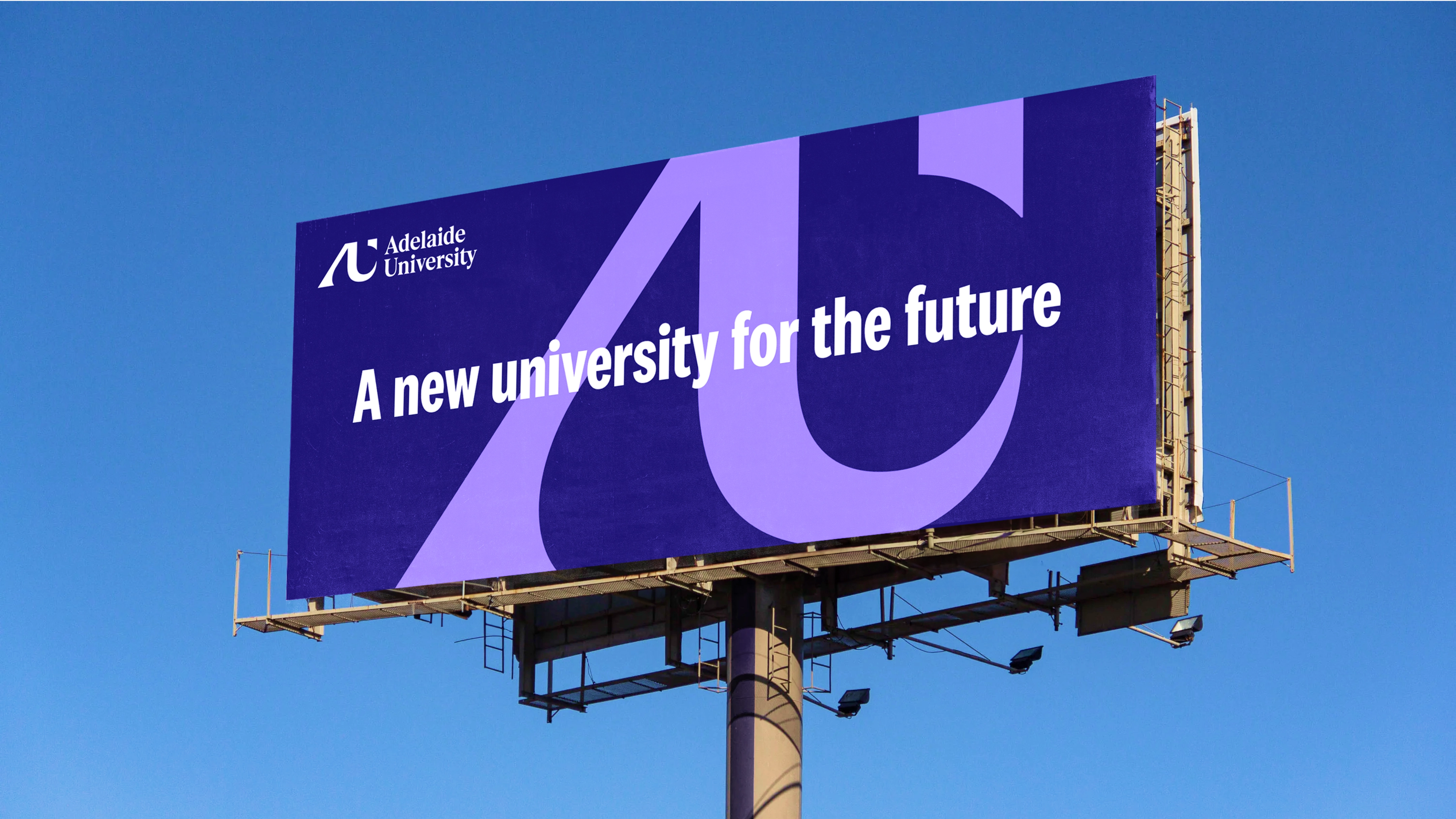
The logo is an abstract monogram inspired by the architecture of the iconic Adelaide Festival Theatre, conveying progress and momentum. The A in the composition is crafted in serif style, a reference to academia that suggests that this is a pedigreed institution. The U features a sense of upward motion which expresses energy and culminates in a shape that references the state of South Australia, a nod to the people the new university will serve. This is accompanied by a logotype in a contemporary serif font that radiates gravitas, with just enough personality to help ground the monogram.
The colors were chosen to echo the navy blue used by both founding institutions, combined with a contemporary digital blue and an unexpected purple hue that is reminiscent of trees that blossom across South Australia, heralding the arrival of summer. The remaining visual system provides flexibility between ‘proven,’ ‘audacious’ and ‘open’—the design principles that drove the visual and verbal expression—enabling the new university to appear established when relevant and challenging when appropriate.
An international-first debut
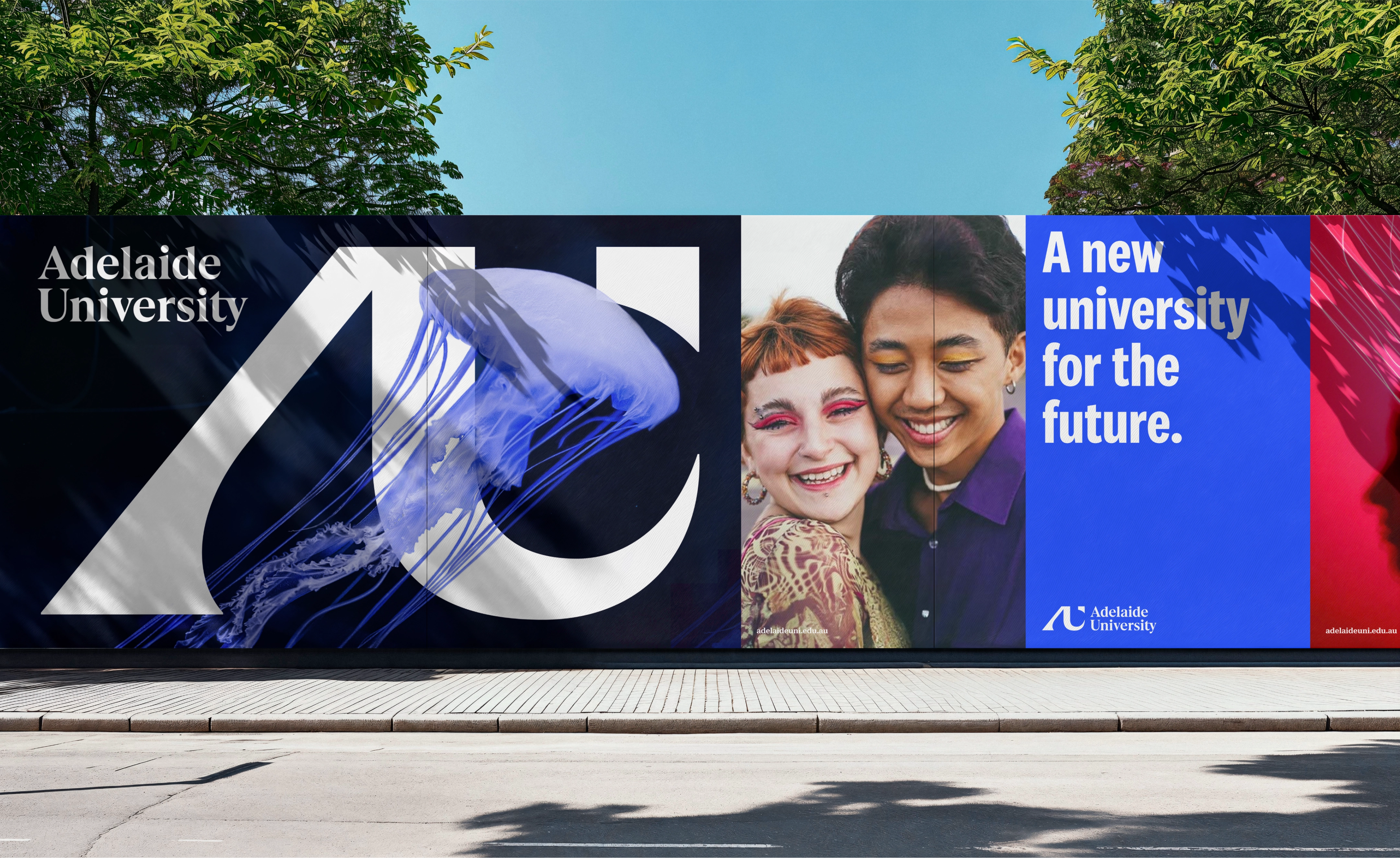
The new brand launched July 2024 across key international markets, then in Australia ahead of the first cohort of students beginning in January 2026.


