Timberland

Evolving a heritage brand for future growth
Since debuting its iconic boot in 1973, Timberland has never gone out of style.
From outdoor enthusiasts to professional trade workers to celebrities, the outdoor lifestyle brand has been represented across the globe in all walks of life.
However, even beloved brands need to evolve. As Timberland grew into a global powerhouse, its brand expression was dated across geographies and, thus, lacked the ability to truly own its place in the market. This sparked an internal exercise of defining Timberland’s visual identity and how it wanted to evolve. And, along with this repositioning, the brand was planning several external moves that would set the tone for its future, including a new global campaign and the opening of two flagship stores.
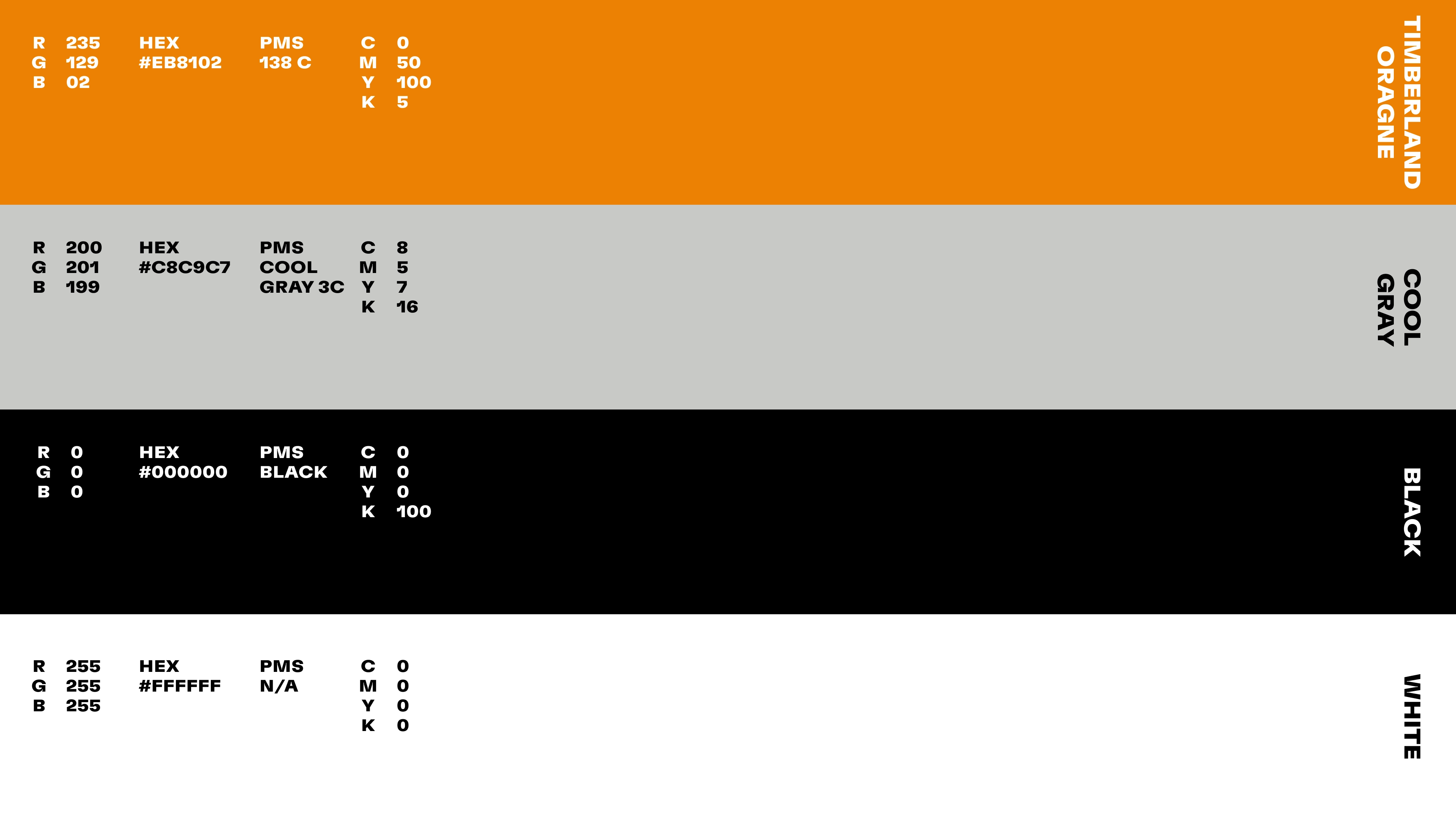
We started with the two most own-able assets in Timberland’s toolkit. With its Tree symbol, the brand has a level of recognition that few could claim. Second, Timberland’s iconic orange color presented a huge opportunity for the brand. Currently used inconsistently across brand touchpoints, leveraging the color as a unifying factor in the visual identity was untapped potential.
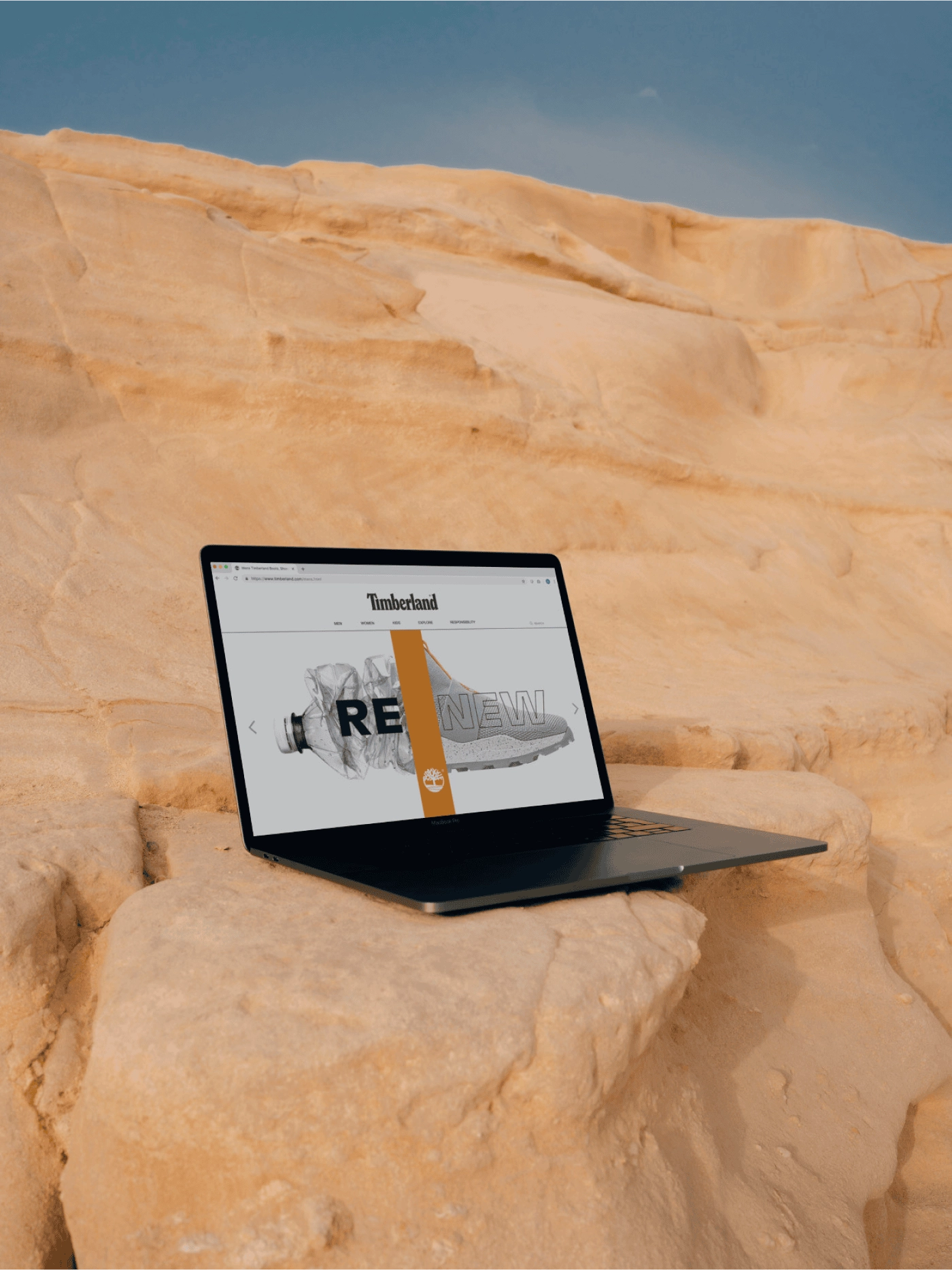
At the center of the new visual system is the Tree Path, a flexible visual device that highlights both iconic elements and drives brand recognition. Working across different marketing channels as well as on product and in retail environments, the Tree Path can be used throughout the brand experience for consistency and impact. From leading to powerful statements on signage and collateral to highlighting bold messaging across digital platforms, the symbol allows Timberland to be more confident and engaging across its visual system.
Surrounding this unifying element is custom typography and a new, fashion-driven photography style that pays homage to Timberland’s nature-centric heritage. The new brand voice and messaging hierarchy is defined by activism and advocacy, providing Timberland a bolder platform on which to engage its community and showcase that it is a visionary leader in the world of sustainable fashion.
Together, these elements are the glue connecting the brand’s visual system, bridging the gap between its diverse audiences, and most importantly, driving home Timberland’s mission: to create a desire to step outside and make the world better.


